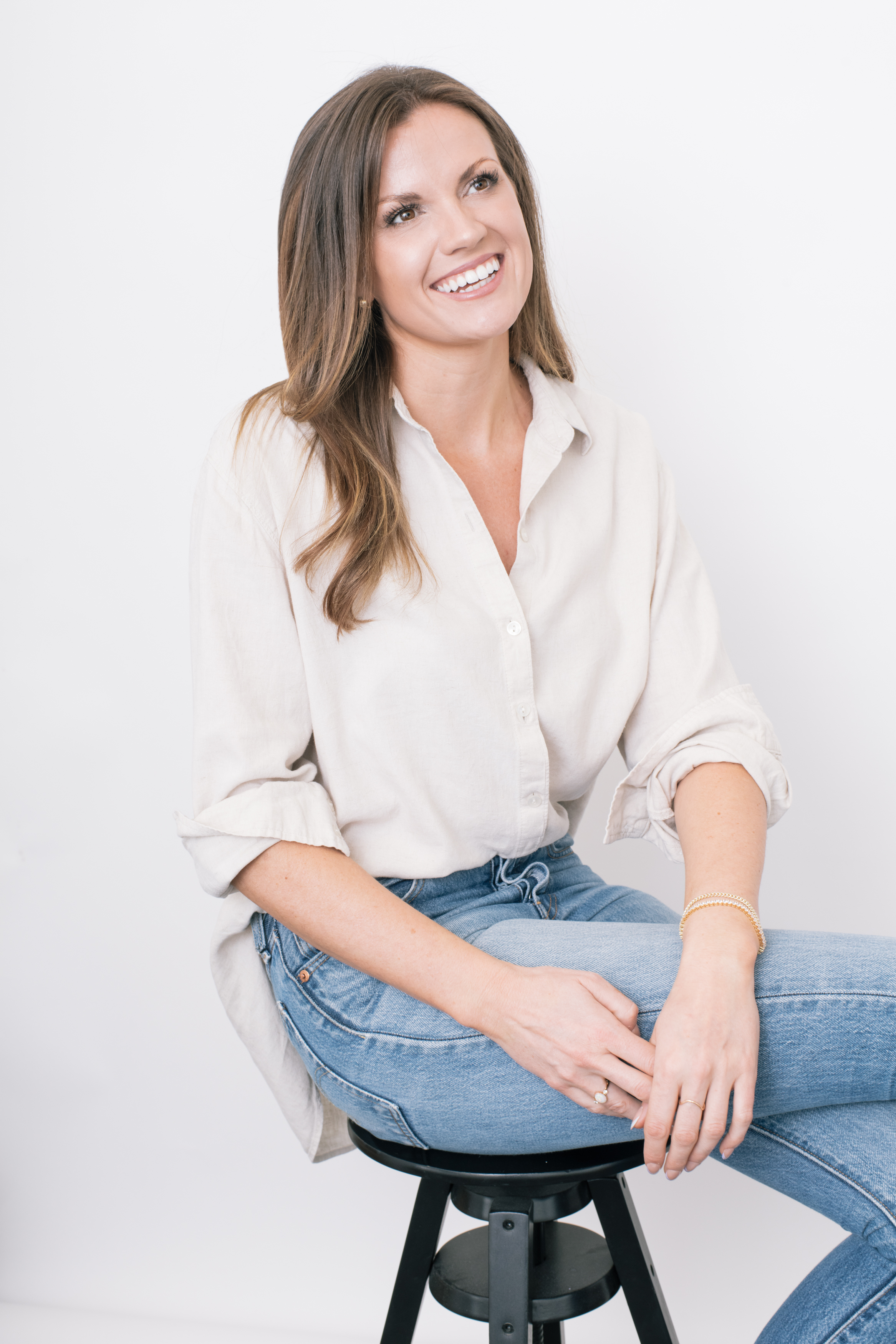
Designer and director working on the fundamentals of life – where we live, how we get there, how we power it, and occasionally what we eat and drink.
Track record
Led design at two Alphabet-backed ventures, arriving before either had a design function. Won the Michigan DOT contract that created Cavnue, now a TIME Best Invention, as sole designer on a three-person team. Built the content architecture behind a 1,524-page city plan taught at Harvard, and the narrative behind a $1.4 billion raise.
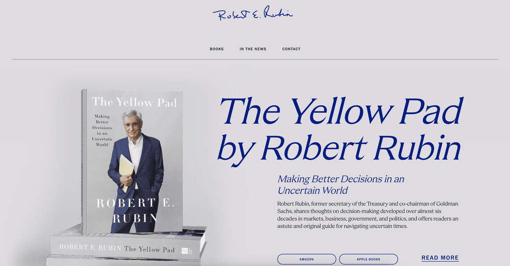
Directed Pentagram, Heatherwick Studio and Squint/Opera. Since then the work has run across housing, clean energy, public-sector giving, wine education and a former Treasury Secretary’s archive.
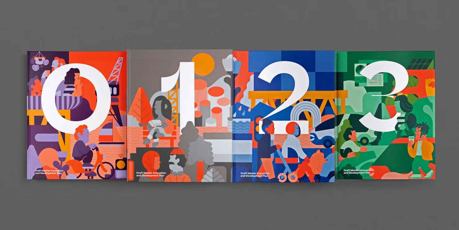
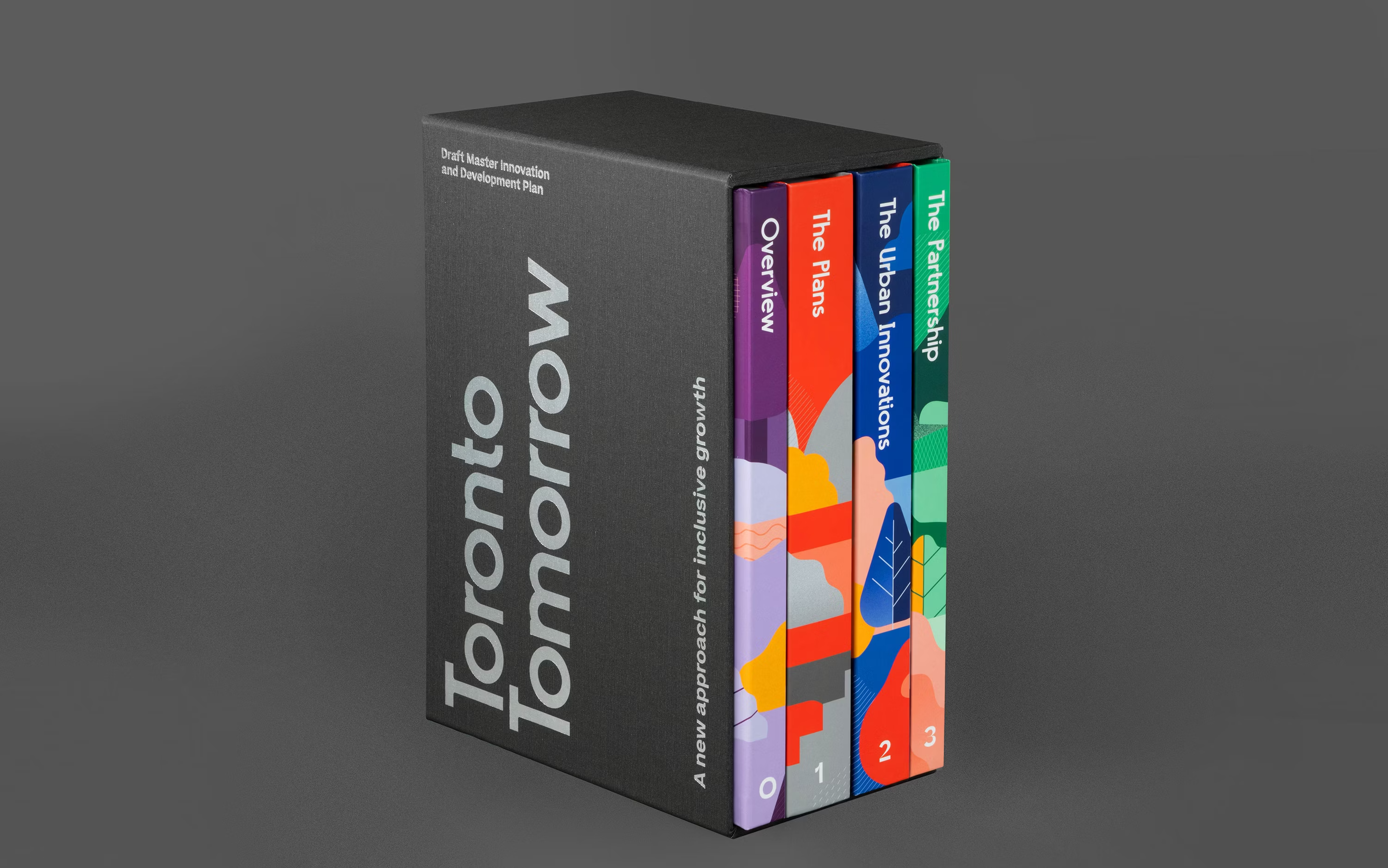
Toronto TomorrowSidewalk Labs • Google / Publication systemSwipe to preview→ 2019
I help founders and companies make their brands undeniable.
Design & strategy director Narrative architect London • New York Selected 2019–2026
Led design teams inside Alphabet-backed ventures and bets. Built a 1,524-page city plan now taught at Harvard, directed the brand for America’s first automated vehicle corridor, and made the materials behind a $1.4 billion raise. Fractional design director across housing, clean energy, public-sector giving, wine education, and a former Treasury Secretary’s archive. Comprehension before composition: understand the material first, then design the structure that carries it.
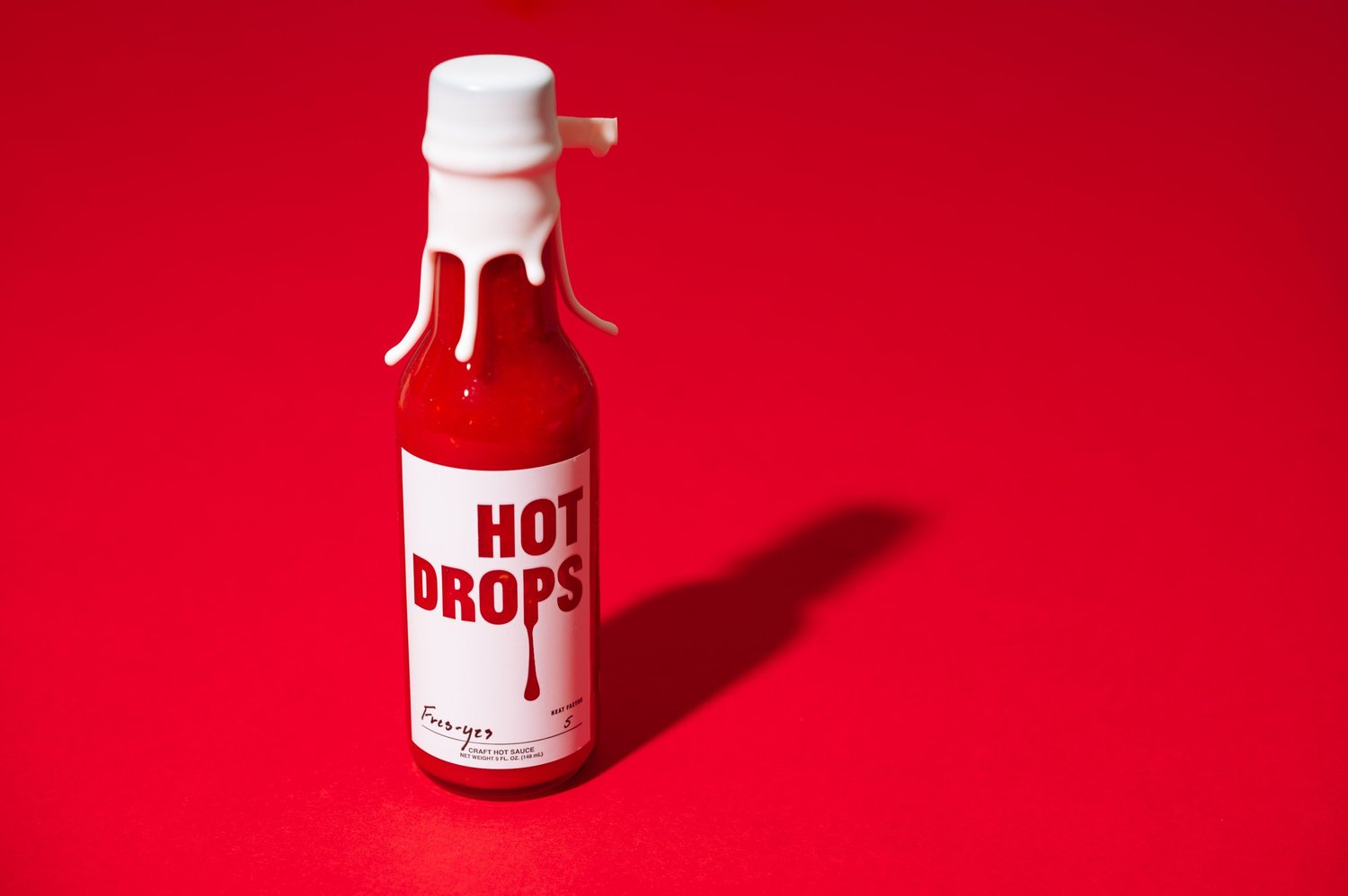
Toggle the knockout. Printed, the wordmark is one flat ink. Knocked out, it fills with the sauce. Which is exactly the colour that goes into the palette above.
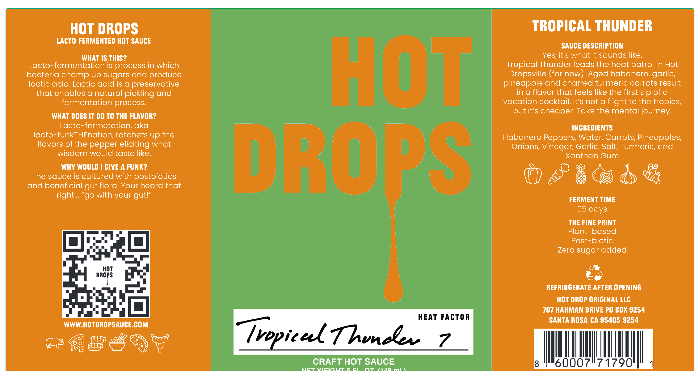
{{ dieActiveTitle }}{{ dieActiveBody }}Die5.570 × 3.010 in, 0.0156 in corner, 0.125 in gapSubstrateClear BOPP 2.0mil / S7000ER / 1.2PETSeparationsCMYK + white + D-stock clear: the clear plate is the saucePressMCC Napa, job 81800. Seven items on one proof
{{ p.annoTitle }}
{{ p.annoNote }}
{{ annoActiveTitle }}{{ annoActiveBody }}
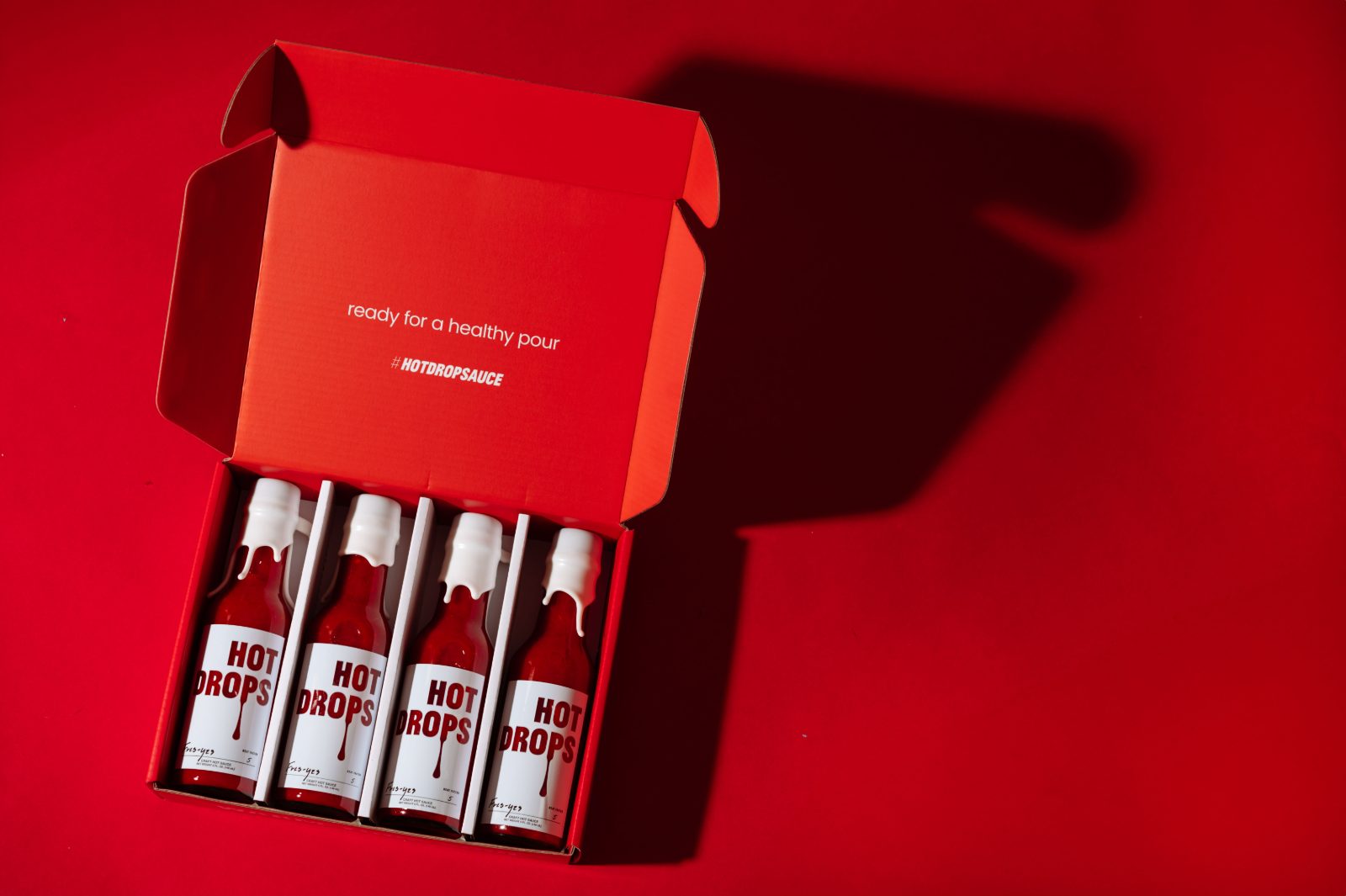
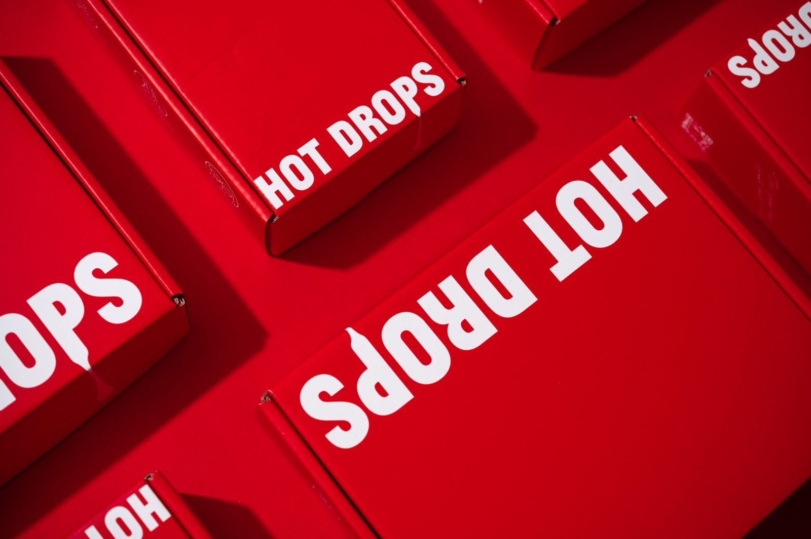
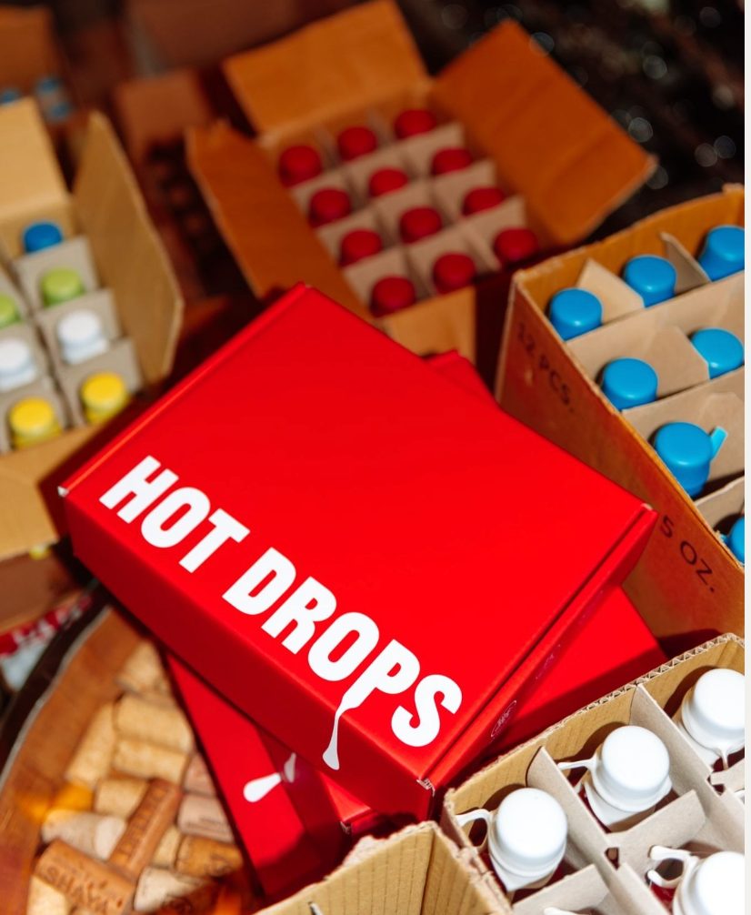
The box, madePrinted, folded, packed. The mailer with the four-bottle insert seated inside.
{{ p.socialTitle }}
{{ p.socialNote }} Pick a cut on the right; tap the frame to pause.
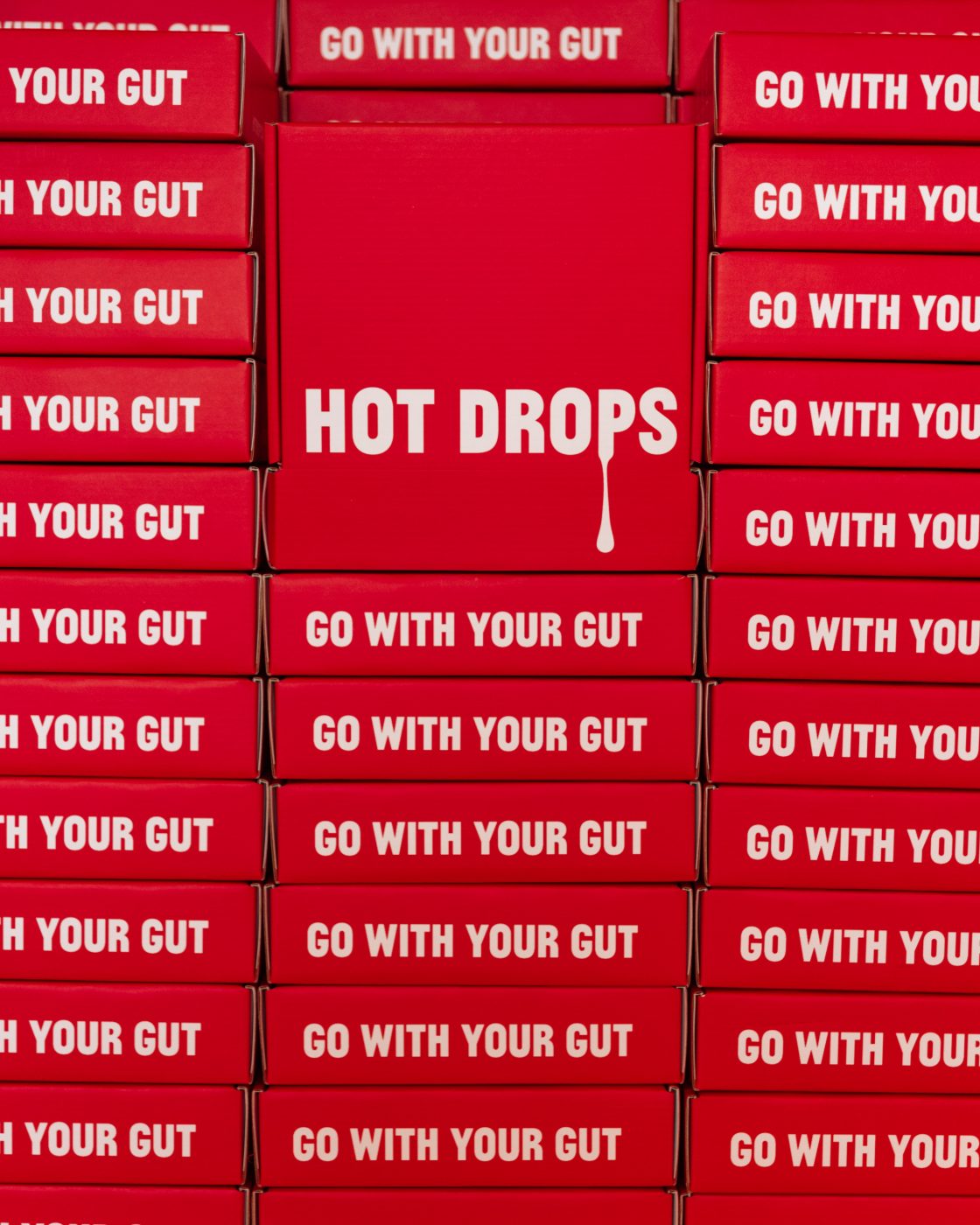
hotdrops· 4hSend messagehotdropsSanta Rosa, Californiahotdrops {{ socialTag }}#HOTDROPSAUCE · Go with your gut{{ socialChrome }}
Execution
{{ p.execNote }}
{{ ef.figure }}{{ ef.label }}
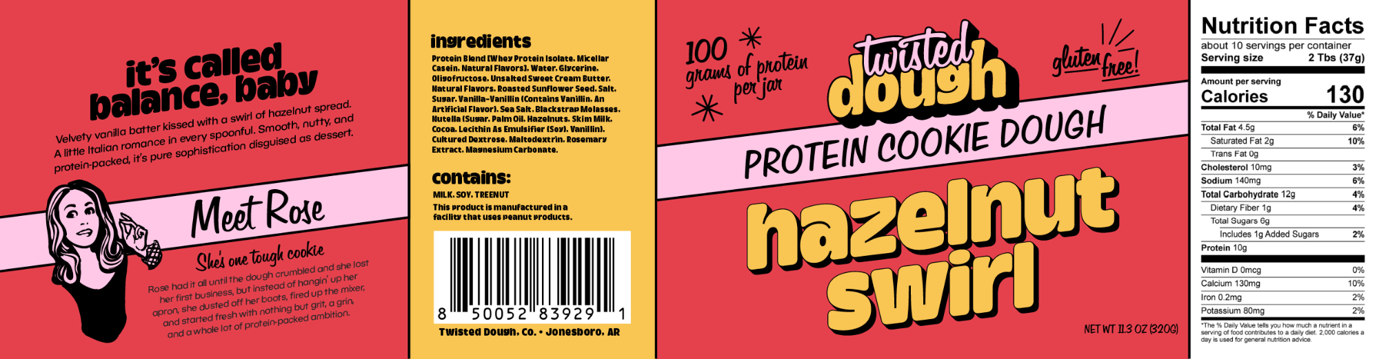
One dieline, four panels — story, ingredients, front, nutrition
The flavour wall, one saturated ground per SKU
{{ k.name }}
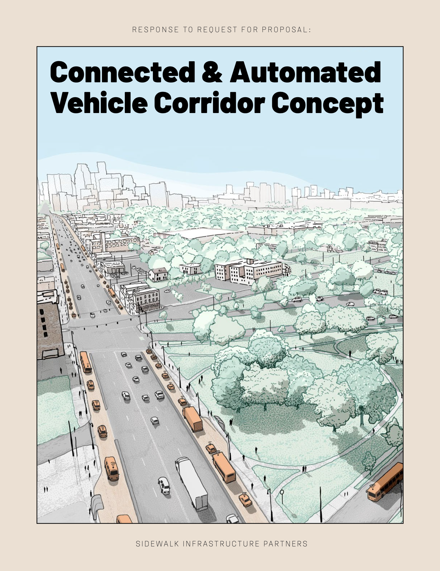
The proposal that created the company
Fifty-five pages answering MDOT. The vision statement, the two futures, the four-layer stack, the build and deploy sequence, the business case, the route and the team, in one document. Nothing in it had been built.
Sixteen approved pairingsThe outer field is the label ground, the logotype carries the counter colour, and the bottom fifth is the ground lightened. Black appears only as the hairline and the letter outline, and that is what holds every pairing together at shelf distance.
One hundred and three particles resolve into a C. The logo makes the argument for separate holdings on one platform before a word of copy is read.
CATALYST®
{{ p.audienceBandTitle }}
{{ p.audienceNote }}
{{ a.figure }}{{ a.label }}{{ a.source }}
{{ g.head }}{{ g.meta }}{{ g.note }}
*{{ p.galleryNote }}
{{ p.craftTitle }}
{{ p.craftLead }}
{{ p.craftNote }}
{{ c.kicker }}{{ c.title }}
{{ c.desc }}
{{ chip.label }}
{{ ph.cap }}
{{ f.figure }}{{ f.label }}
{{ c.aside }}
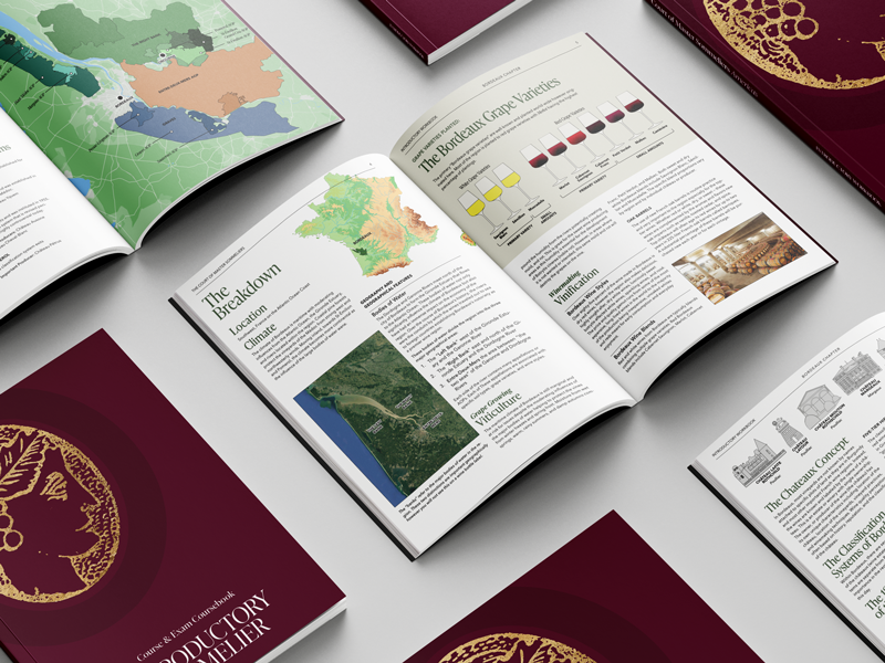
The wine colour system
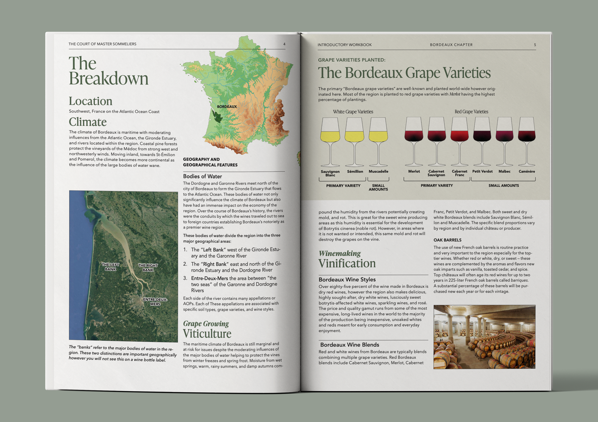
I hand-coloured every glass to its true appearance and placed them chapter by chapter, white before red, which lets a student meet each region's varieties in the order the book teaches them.
64Glasses drawn 16 chapters
{{ wineActiveName }}
{{ wineActiveNote }}
{{ band.label }}{{ band.count }}
{{ w.name }}{{ w.desc }}
The first growths
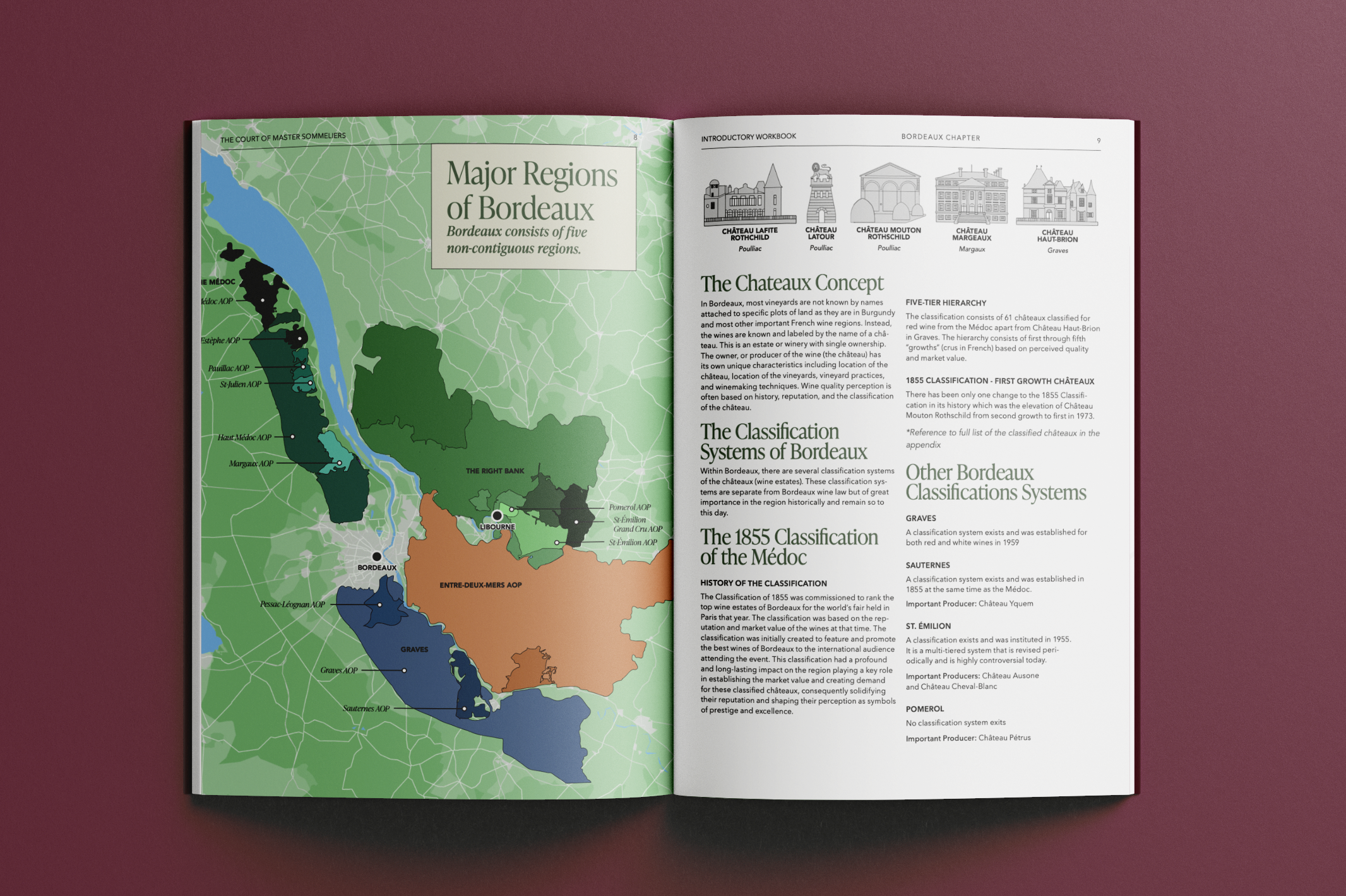
I drew five châteaux for the Bordeaux chapter and rendered the 1855 classification in the same hand as the glassware, which puts architecture and appellation in one visual language.
Bordeaux chapter 1855 classification
{{ c.name }}{{ c.appellation }}
Cartography
Every chapter opens with a locator, a terrain map and an appellation map. I built one cartographic key and held it across every region, and geography reads the same way each time.
Three map types Fifteen regions
{{ m.region }}{{ m.label }}
Taxonomy
The source text was coded for visual need and narrative weight before any design began. Every asset in the book traces back to that tagging.
KeyAsset code format[Type][Scale], [Role]Every asset in the four volumes carries one of these codes, which is how a spread could be specified before it was drawn.
Parent brandThe parent is the ground everything else stands on.I designed the SIP logotype to be pressed into the stock itself, with no colour and no motion. It never appears beside the platform companies as a sixth peer. It sits underneath them.The platform marks work the other way around. Each one is a modelled, lit object carrying a single idea. Cavnue is a corridor, CoFi a coverage dome, Resilia a storage grid and Polysift a conveyor loop. Because they are objects rather than flat symbols, turning one explains the business.I set the vision and strategy in-house, then interviewed and hired the partners to execute it. Kilograph and Try Studios built the 3D and environments, Squint/Opera made the film, and I brought on independent illustrators, animators, photographers and developers for the rest. I briefed, art-directed and reviewed all of it, because five companies and a parent had to read as one system.Identity, website, and every RFP, white paper, press release, animation and illustration the firm issued.
01 · Ground stateThe parent is fixedIn physics, the ground state is the lowest and most stable level a system can occupy. SIP is blind embossed with no colour, and every platform is a step away from it.
02 · Excited stateEach platform is a particleEnergy moves a particle into a fixed orbit in one jump, with nothing in between. Each platform is one of those jumps. I rotated and sectioned a primitive form until the company’s sector was readable in the geometry.
03 · ObservationObserved in four dimensionsA state only resolves once someone observes it. I spun, cut and re-lit every mark for film, stage and print, because how a mark behaves in motion is as much the identity as how it sits on a page.
Building five companies on one physics
Every company obeys the same laws. Each mark carries one idea, gets modelled instead of drawn, and keeps a soft body. A single light source lets any two sit in the same frame.
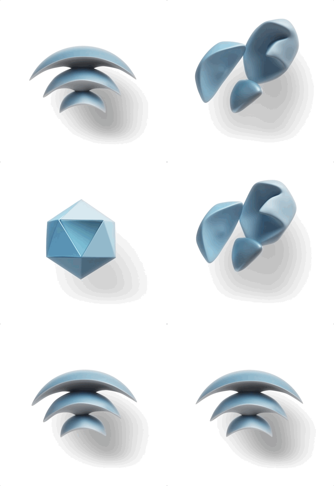
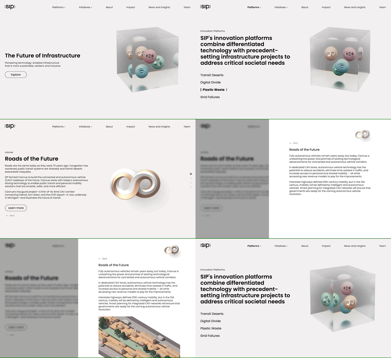
The cube is where the particles become observable. All five platforms are suspended in one volume.
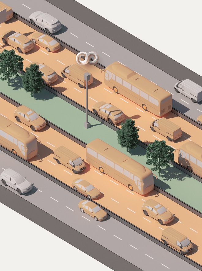
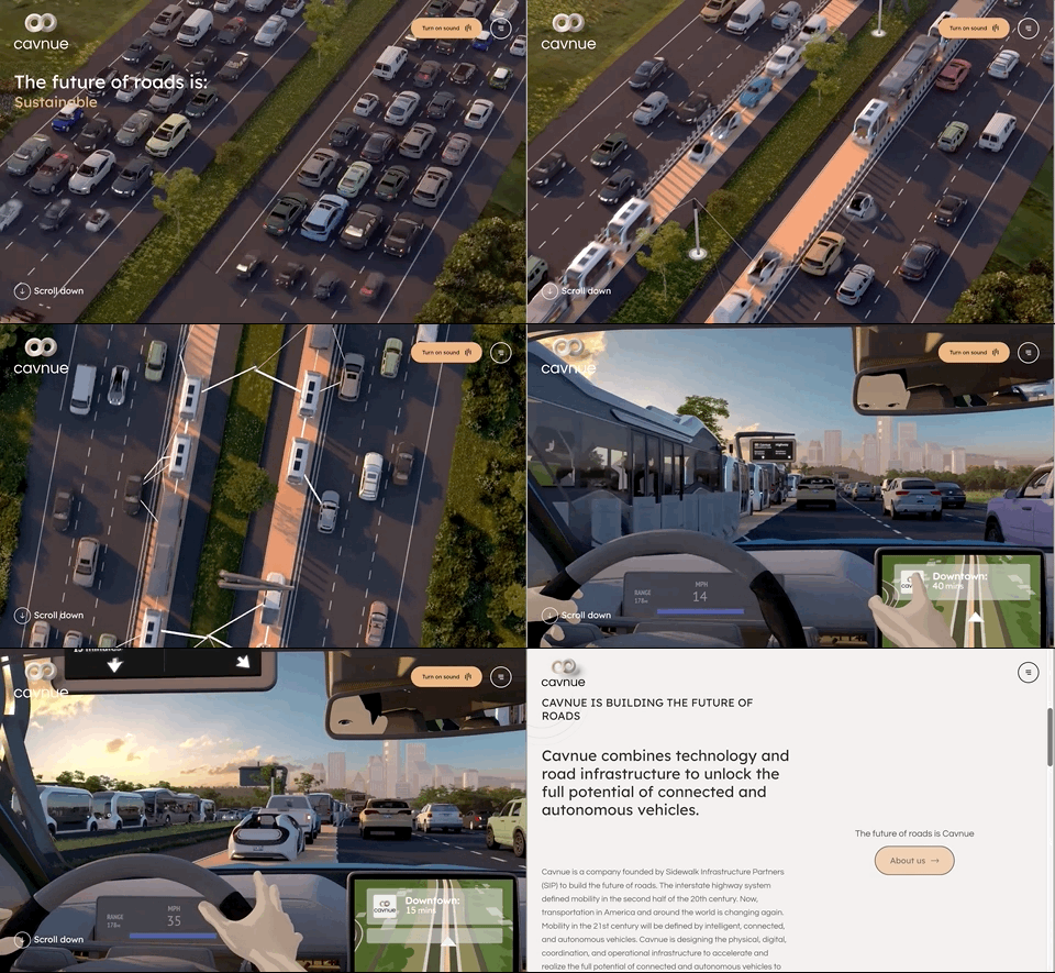
CavnueAmerica's first dedicated corridor for autonomous vehicles.The corridor folded into an infinite loop, in two colours.
VerrusNext-generation data centres, launched as Circular Compute.Carbon-negative computing, waste heat driving direct air capture.
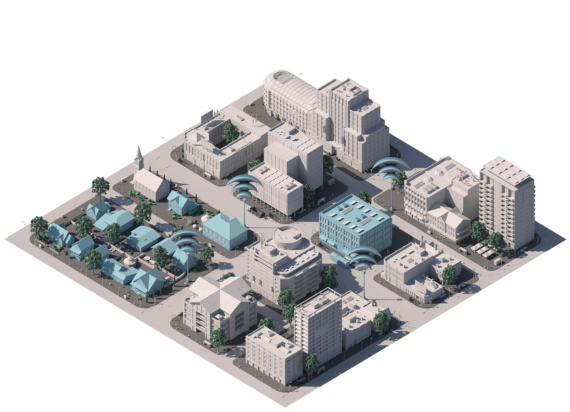
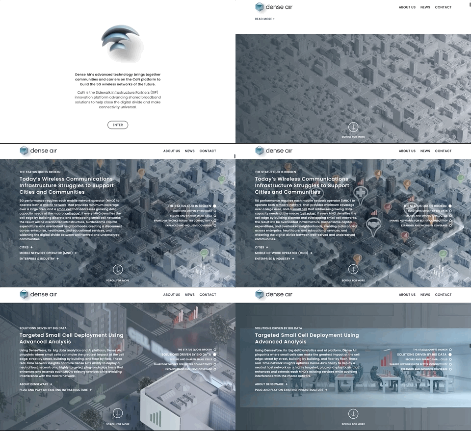
CoFiShared wireless infrastructure for smart cities.A coverage dome built from WiFi arcs, resolving into the Dense Air mark.
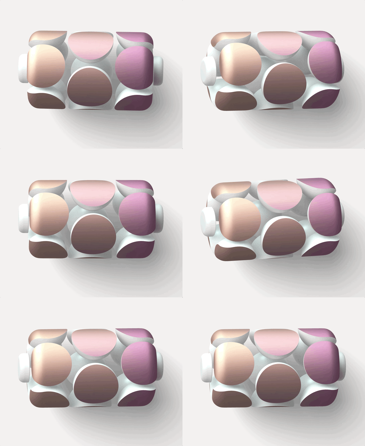
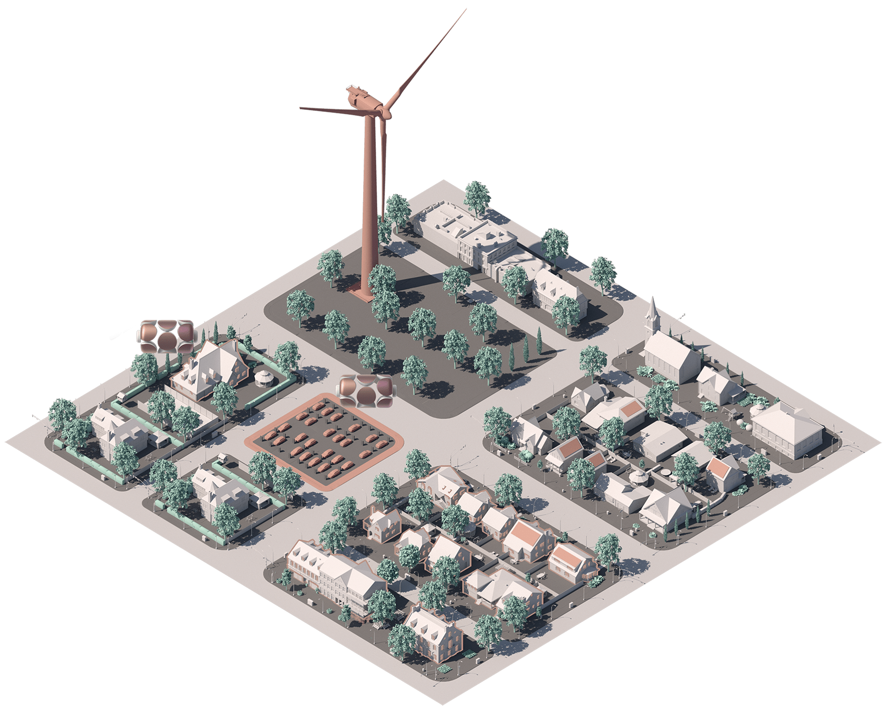
ResiliaAdvanced power plants reimagined for the energy transition.A grid of storage cells running hot to cold, holding charge.
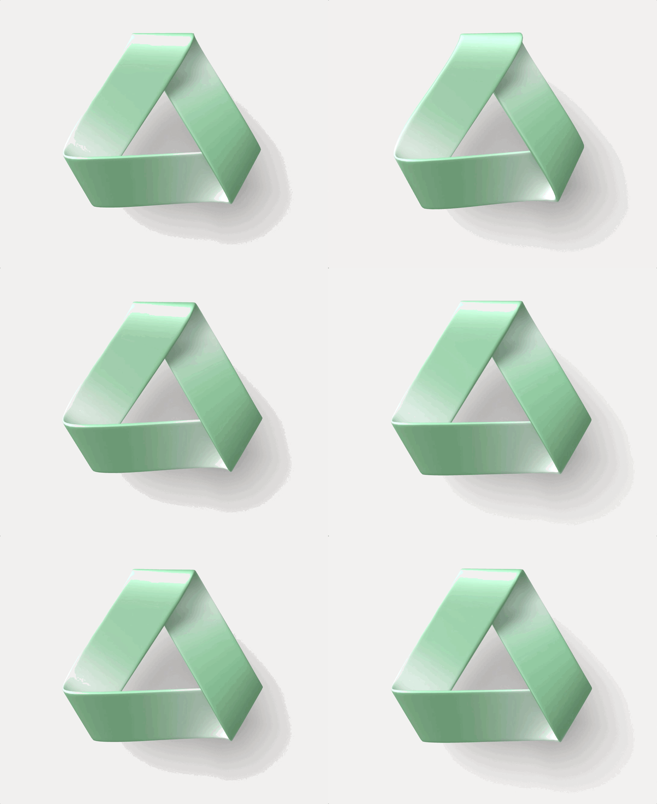
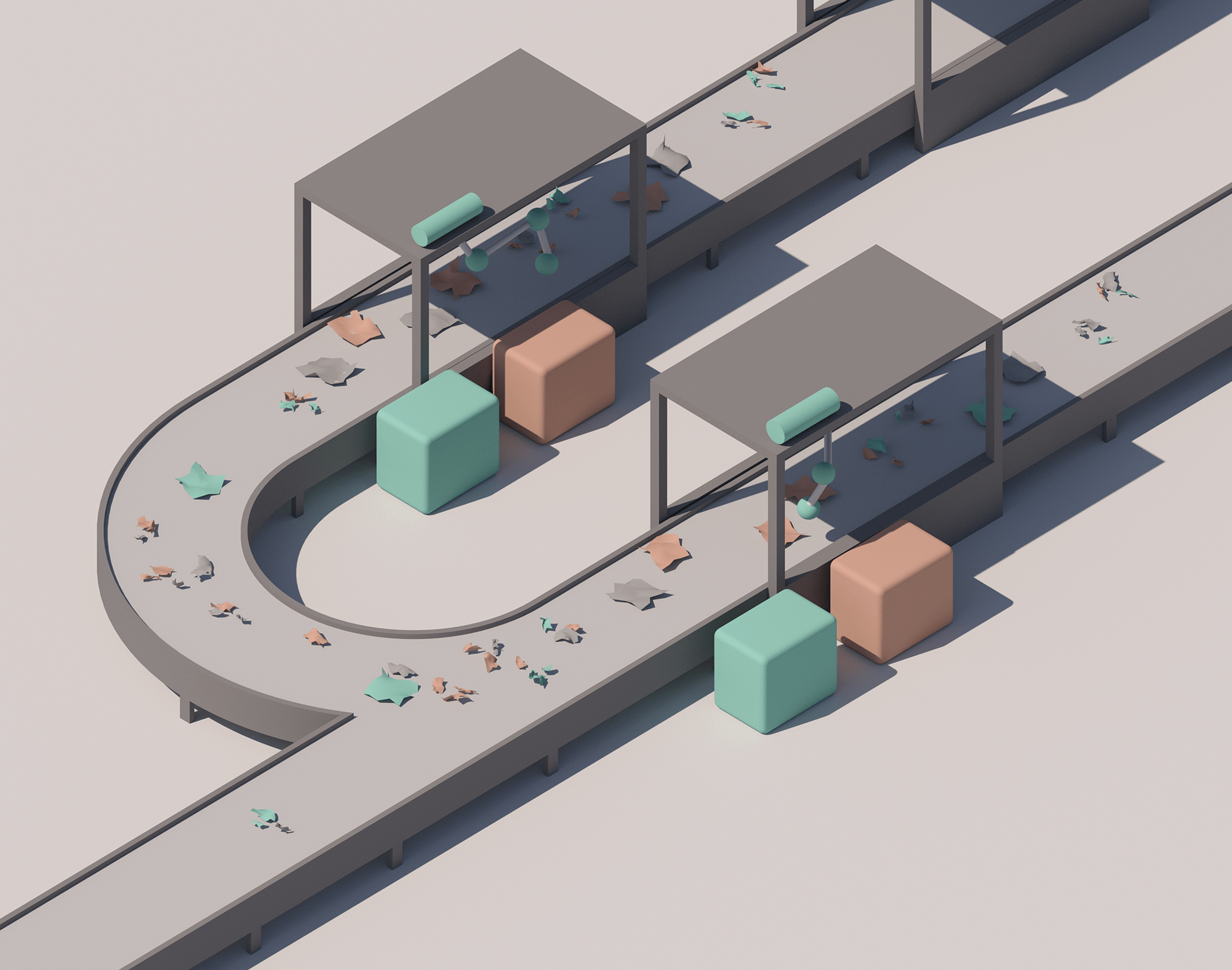
PolysiftRobotics-enabled recycling for the circular economy.The recycling triangle as a möbius conveyor loop.
The film, and the platforms in motion
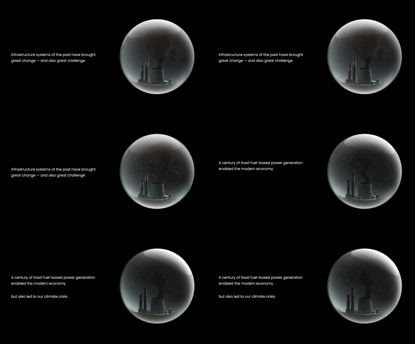
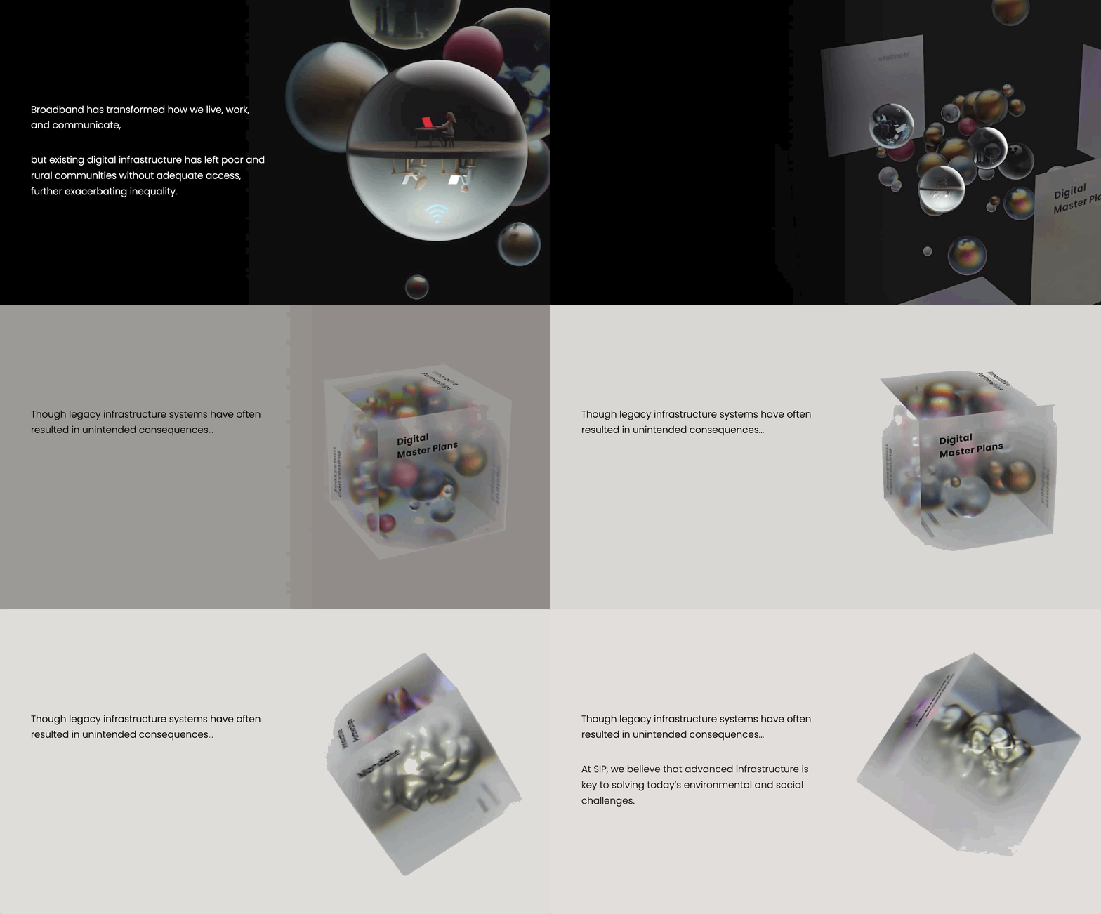
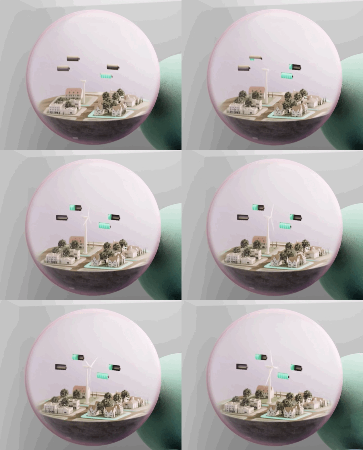
Scene 01The past, under glassRoads, wires and pipes are compressed into a single glass sphere and lit like a specimen. Infrastructure reads as something inherited and sealed.
Scene 02The problems namedThe sphere multiplies. Each one carries a failure, and the digital divide, grid failure and transit deserts all sit in the same frame at the same scale.
Scene 03Launch out of the parentThe SIP cube opens and the five marks are released as particles, each rotating into its own axis and finding its own material and colour.
Scene 04Observed togetherThe camera pulls back and all five are suspended in one volume, with depth of field bringing whichever platform is being discussed into focus.
Infrastructure of the past, held in a glass sphereResilia: distributed storage, village scalePolysift: robotic sortation, plastics recovered at line speedThe digital divide, one sphere among many
Palette and surface
The five platforms sit in one narrow band of desaturated tone, close enough in value that no platform outranks another and distinct enough in hue that any two can share a slide. The palette is mineral rather than a tech spectrum, and sandstone sits behind all five as the parent ground.
Sandstone#E4DDD1 · SIPEtched fine stone
Melon#E7BF98 · CavnueWet resin
Brass#C69D89 · ResiliaBrushed metal
Slate blue#96BBC9 · CoFiFrosted glass
Sea glass#91BAB1 · PolysiftTumbled glass
Periwinkle#7A8EBA · VerrusWet clay
01Etched fine stoneThe SIP logotype is only ever pressed into stock, with no ink and no colour. It is carved instead of printed, which keeps the parent from competing with its companies.
02Wet clay and glassEvery platform mark is modelled as a physical object, soft-bodied and slightly wet, lit from one side. Sub-surface scatter keeps the forms organic where competitors go flat.
03Brushed metalResilia carries a milled-metal finish. The anisotropic highlights streak as the mark rotates, and that declares its axis.
04Frosted depthThe ecosystem cube is a frosted volume with the marks suspended inside it.
Two families, one voice across the parent and all five platforms
Infrastructure has not changed in a hundred years.Lexend DecaDisplay & interfaceFoundryBonnie Shaver-Troup, Thomas JockinUseHeadlines, decks, RFP covers, website, wayfindingA variable family built for reading ease, run from 300 to 600. It holds up at speed. A reader has to take a technical argument in one pass.
A dedicated corridor for connected and automated vehicles.QuestrialTextFoundryJoe PrinceUseLong-form policy writing, body copy, captionsOne weight only, set at 1.6 leading. The rounder geometric bowls keep a fifty-page white paper from reading like an engineering document.
Explanatory illustration
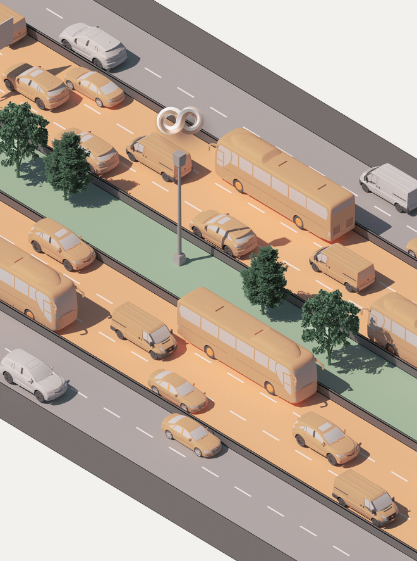
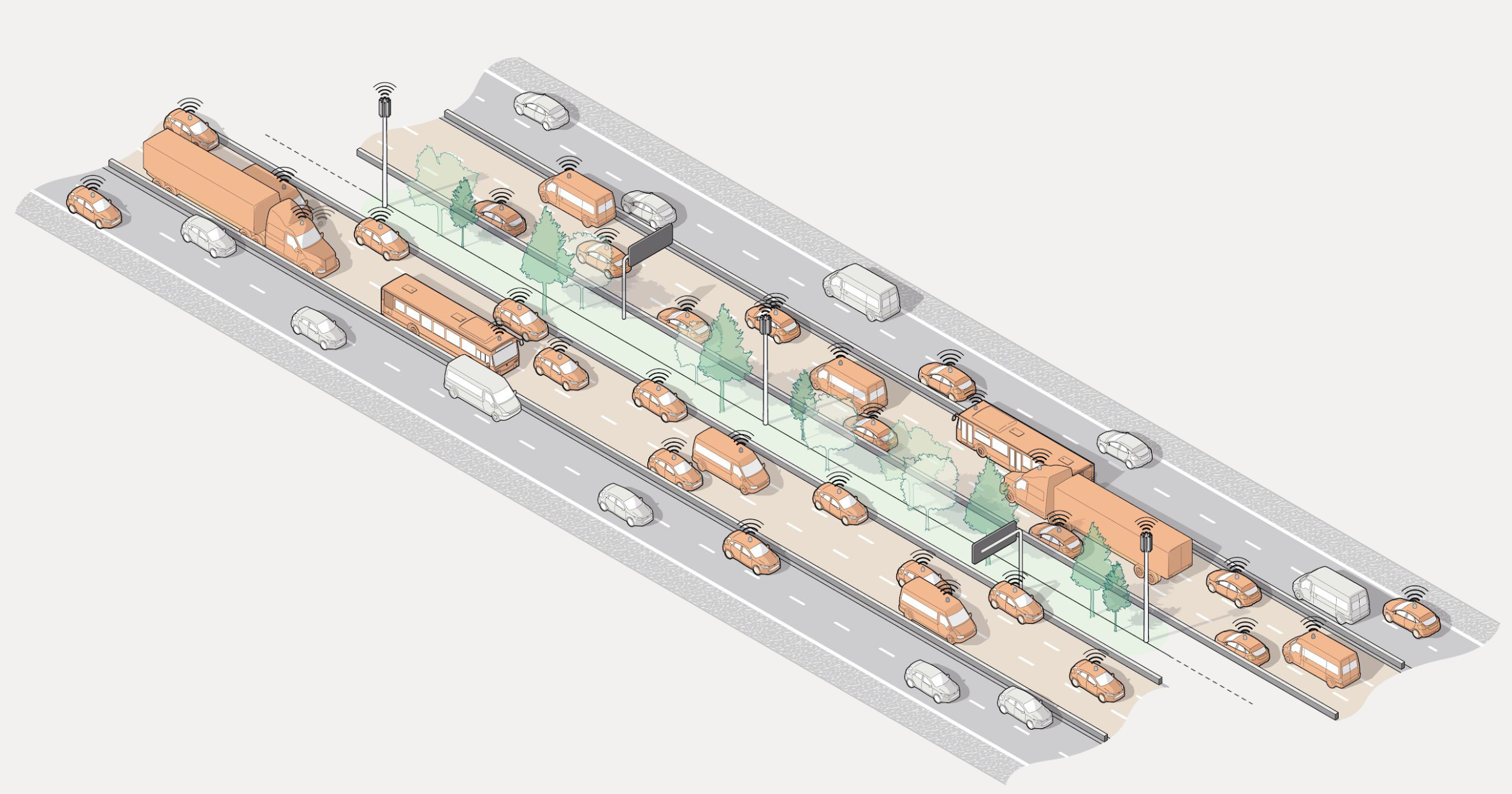
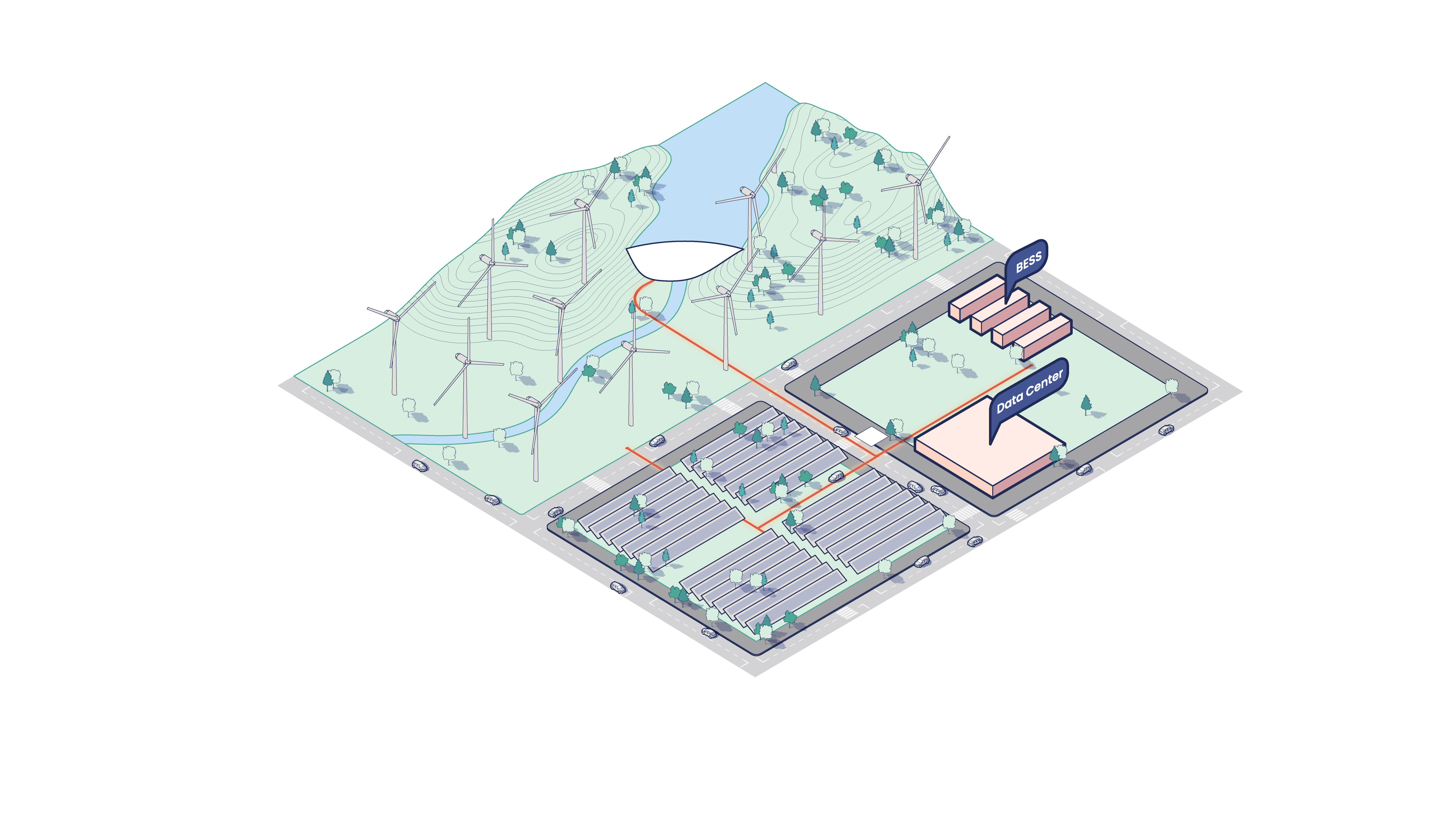
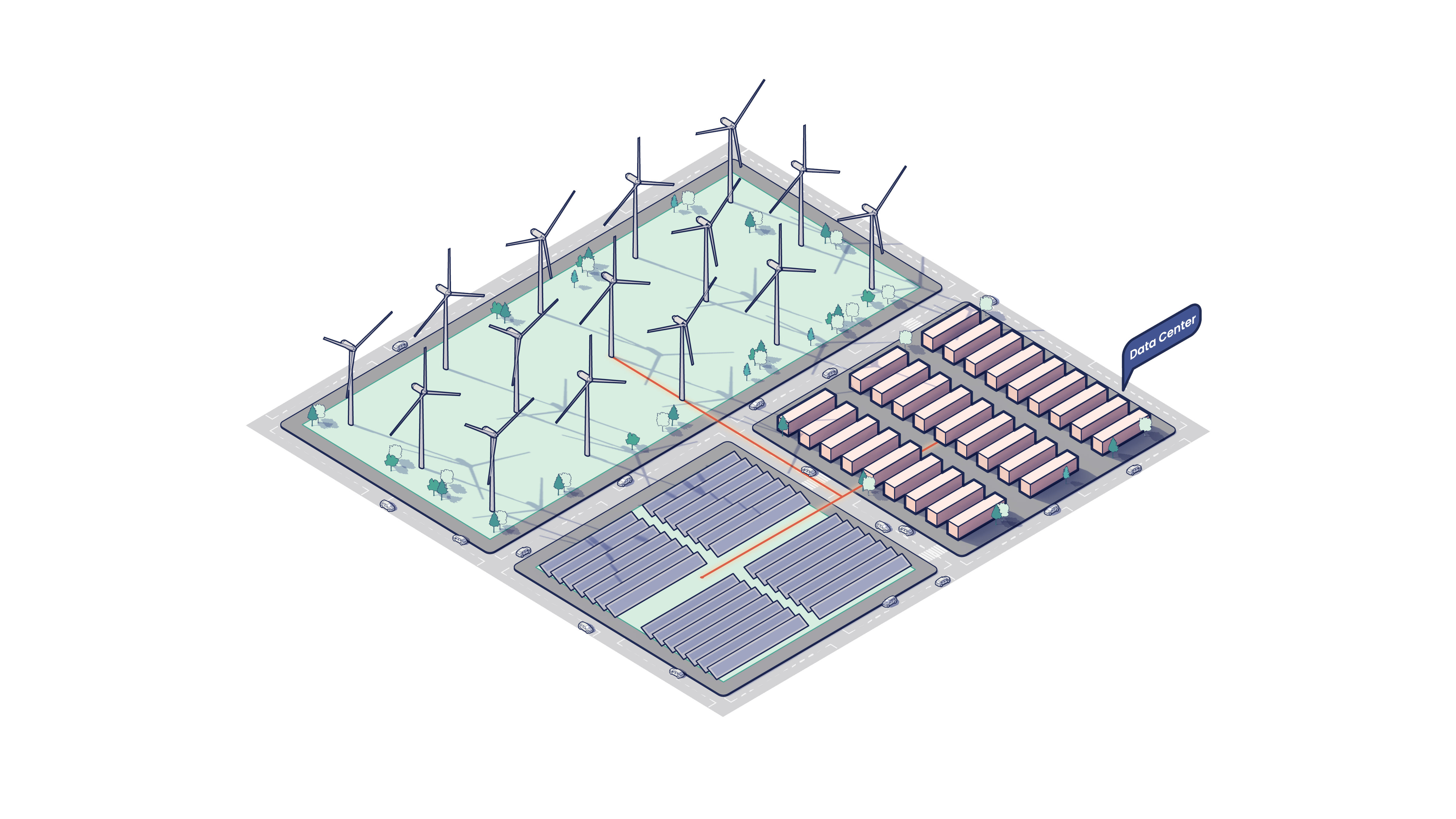
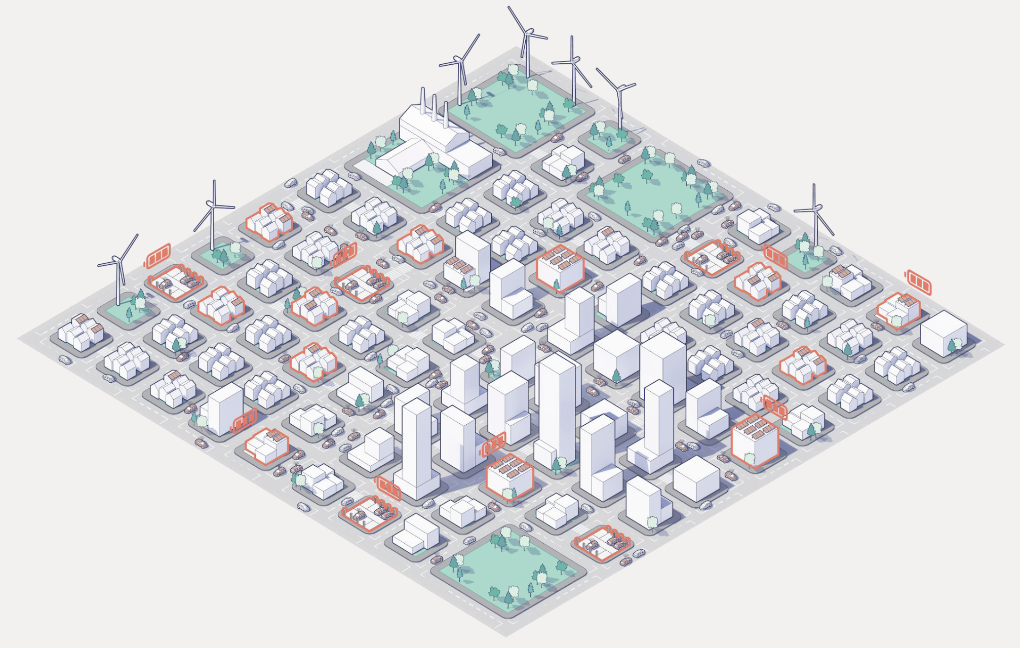
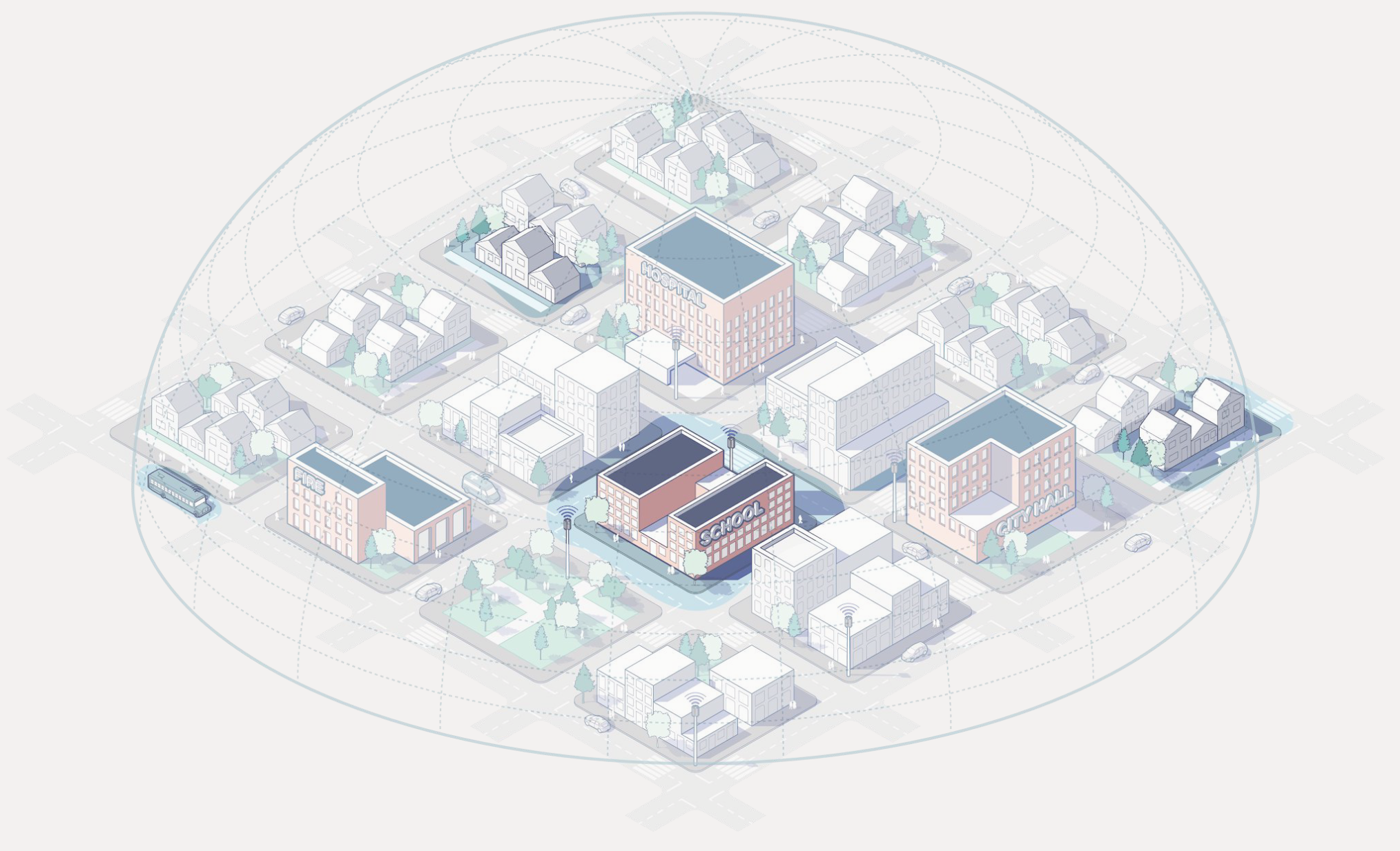
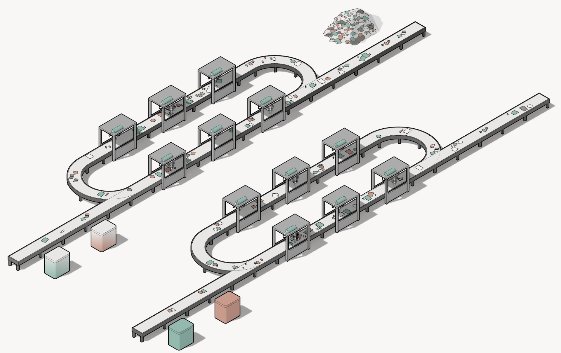
Every platform needed its thesis drawn before it could be sold. I drew a corridor, a data hall, a coverage map and a sorting line in axonometric, and each one explained a technical subject to investors, city stakeholders and press who had never seen the thing being proposed. One drawing language runs across all five, and any two can be read side by side. The Cavnue case study covers that brand in full.
Cavnue · the dedicated corridorVerrus · generation and storageVerrus · the data hallsResilia · power and heat returned to the blockCoFi · coverage shared and sectionedPolysift · robotic sorting
CoFiResiliaCavnuePolysift
$1.4BRaised across Alphabet, StepStone and Ontario Teachers' Pension Plan on the core narrative and LP materials.
1,000+Decks, system diagrams, RFP responses and white papers, most of them made with the co-CEOs and nearly all confidential. Every brief was technically complex, and every deliverable had to be legible to financial, civic and technical audiences at once.
$2.5MBrooklyn headquarters, directed end to end, a hospitality-forward space that embodied the firm's mission. Covered in Dezeen.
In pursuit of the raise
Almost everything here was made to move capital, including the platform theses, system diagrams, RFP responses to cities, policy white papers, the website and the rooms themselves. What follows is what can be shown.
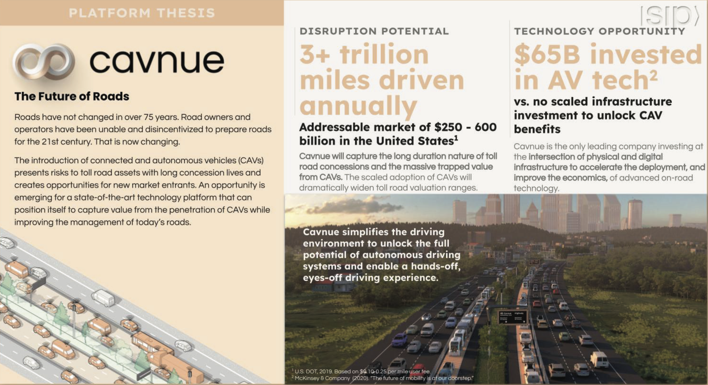
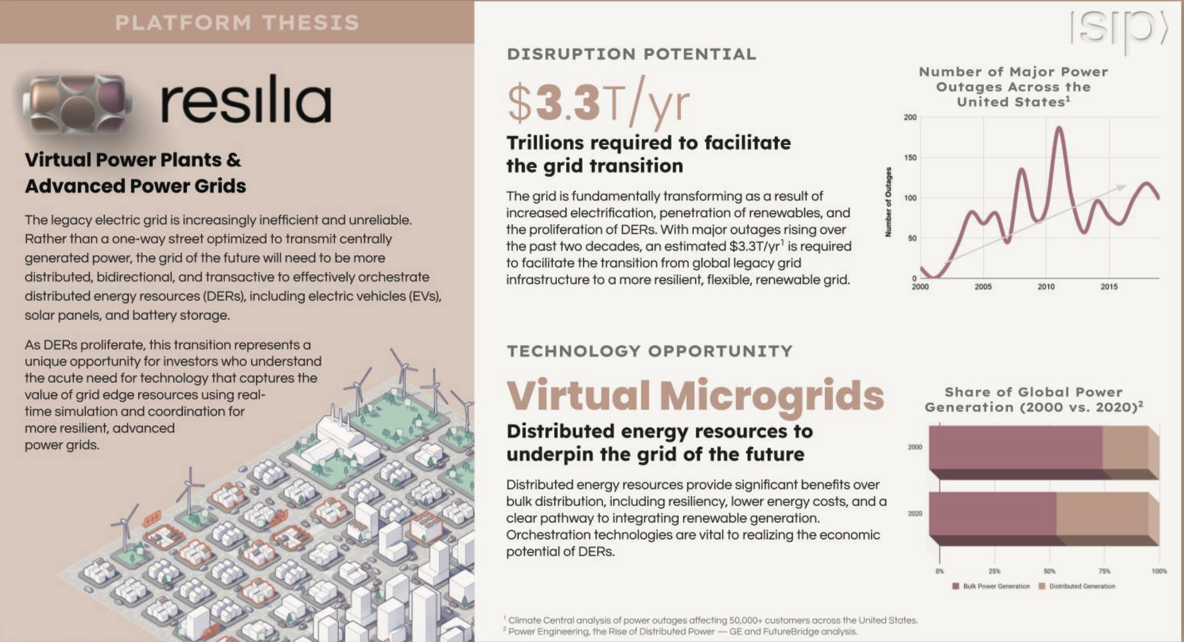
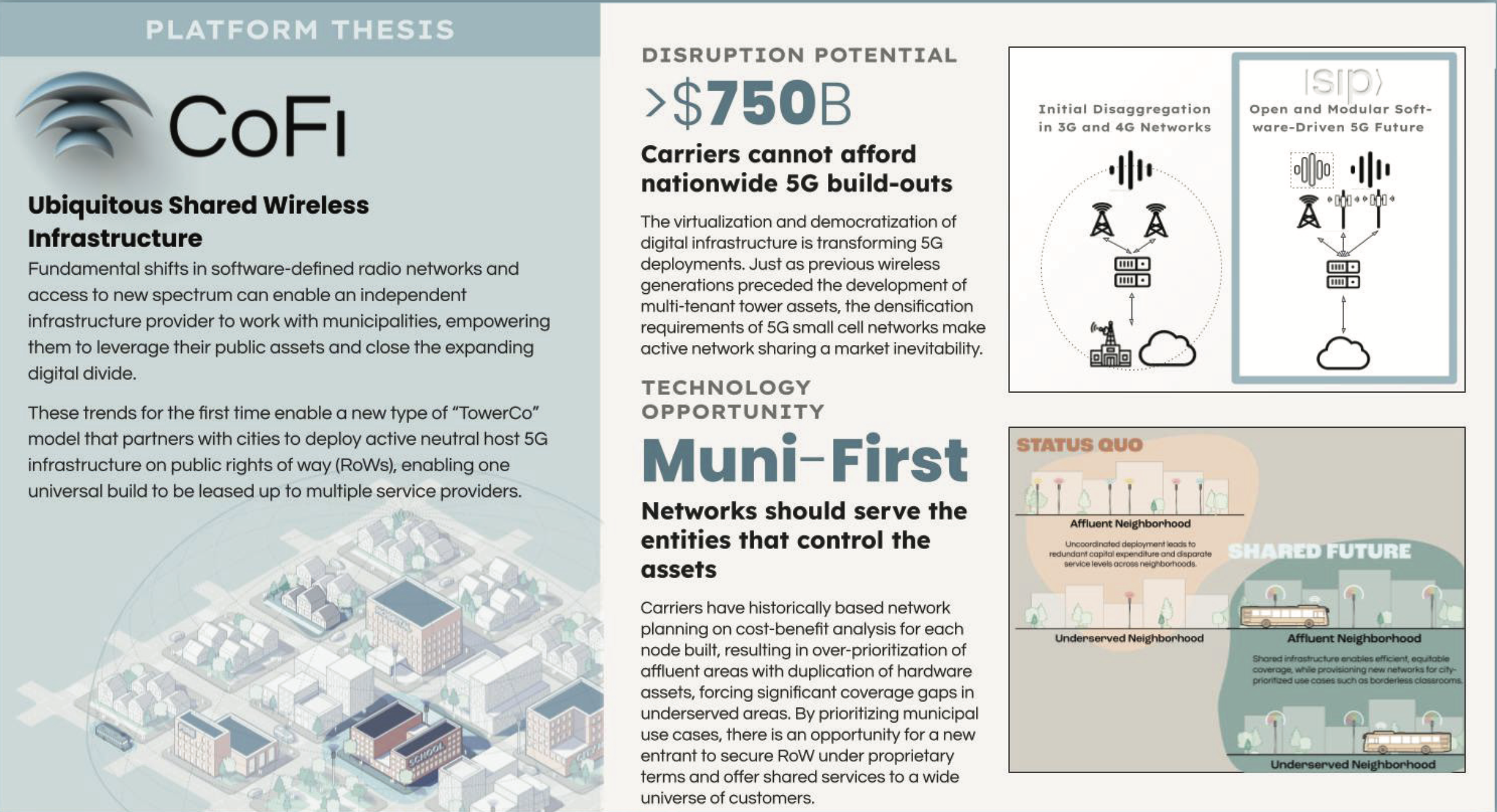
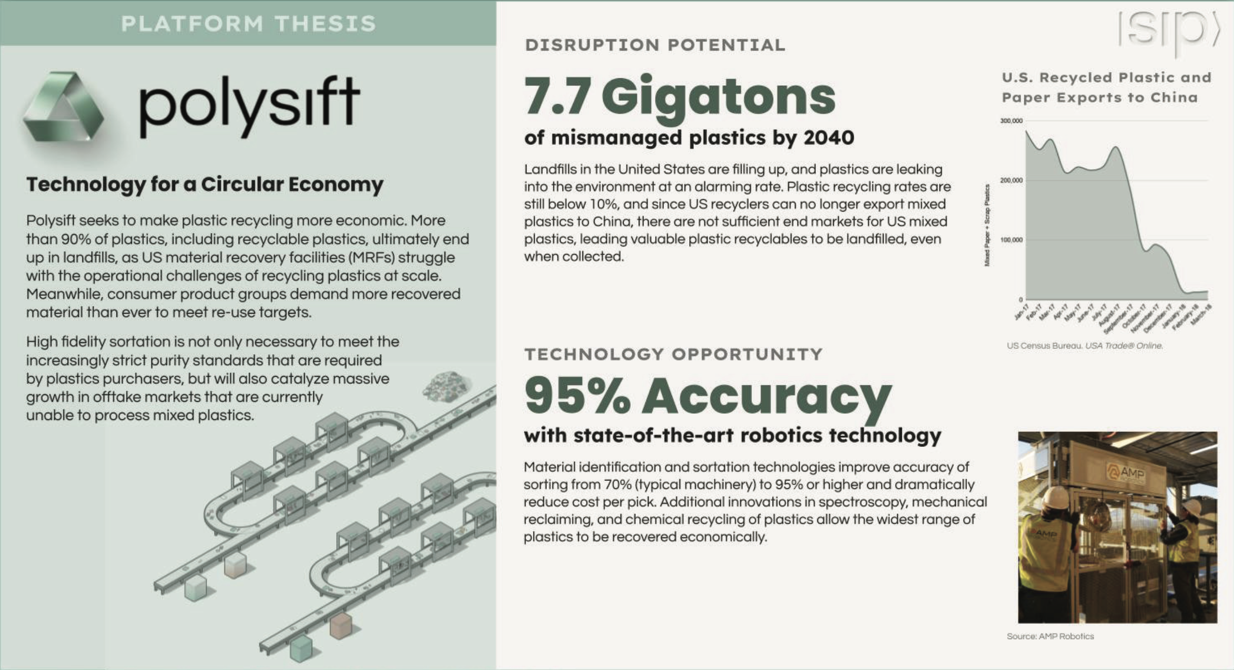
Platform theses, one spread per companyCavnueThe future of roadsResiliaVirtual power plantsCoFiShared wirelessPolysiftCircular economy
A website for every launch or initiative
Each portfolio company launched publicly and needed its own site, with narrative, art direction, motion and build delivered on the launch date the deal set. I made four sites in three years, plus the parent.
sidewalkinfra.com puts the whole thesis in one object, with five platforms suspended in a single system.
Cavnue.com carries the narrative, art direction and launch film. Watch the film
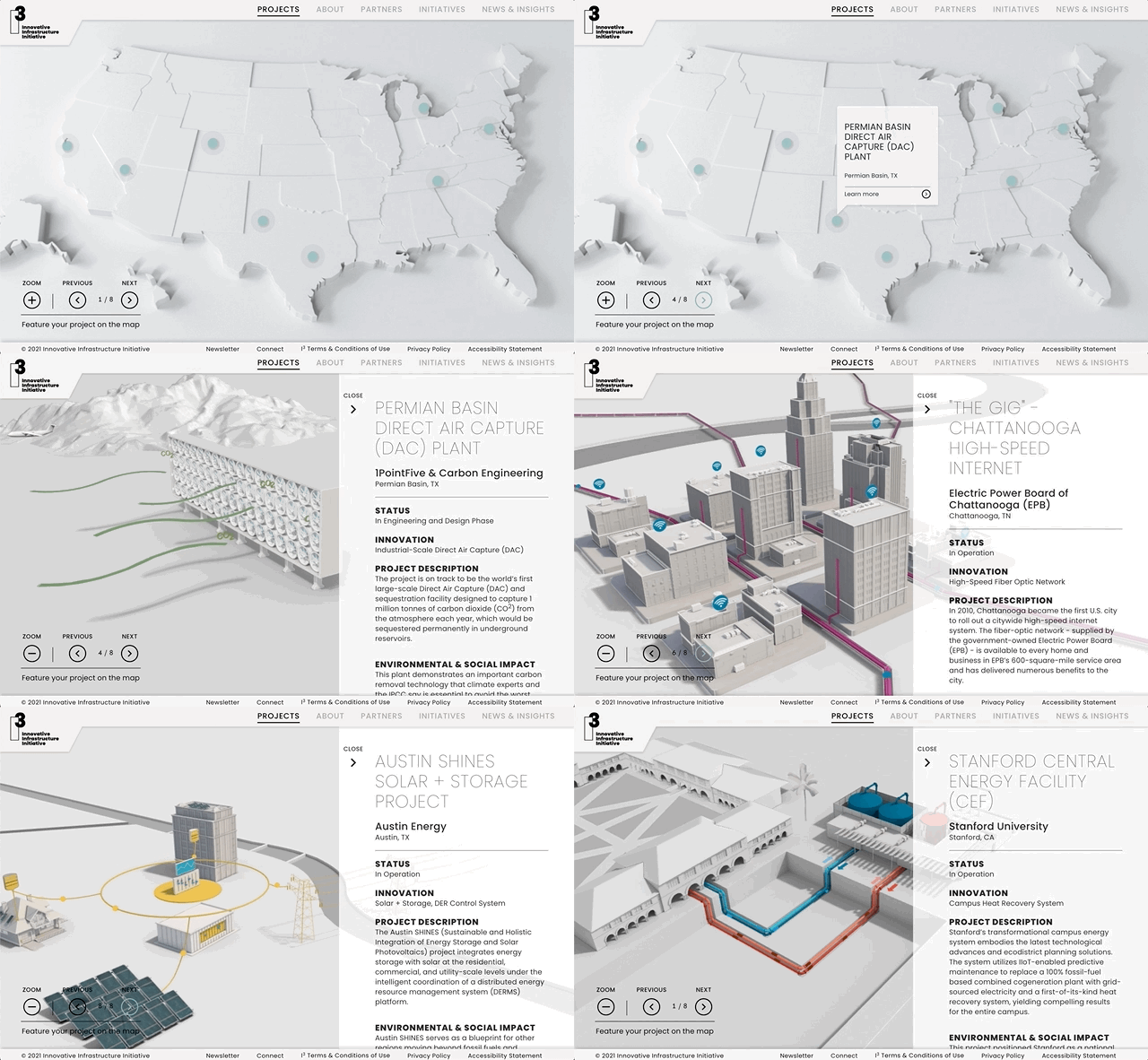
I³ is SIP's public policy platform, the Innovative Infrastructure Initiative.
CoFi's shared 5G platform builds its mark as the page enters.
Proposals and white papers
I produced every RFP response, white paper and coalition plan the firm issued. Design inside the RFP was part of the appeal, and it separated SIP from the other bidders. Hover or tap a line to see its cover.
{{ docKind }} · {{ docClient }} · {{ docYear }}
The Innovative Infrastructure Initiative
An SIP-led coalition initiative, separate from the portfolio companies, arguing for a new class of infrastructure project. I drew eight built precedents in one 3D language, which let a policy audience compare a wastewater tunnel, a fibre network and an autonomous corridor on the same page.
{{ i3Label }}{{ i3Count }}
The i3 website, where the plan was published
The Salons
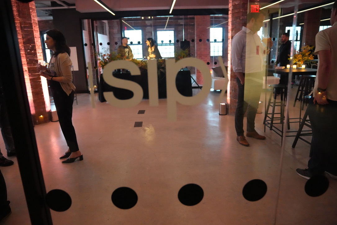
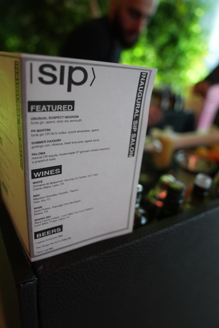
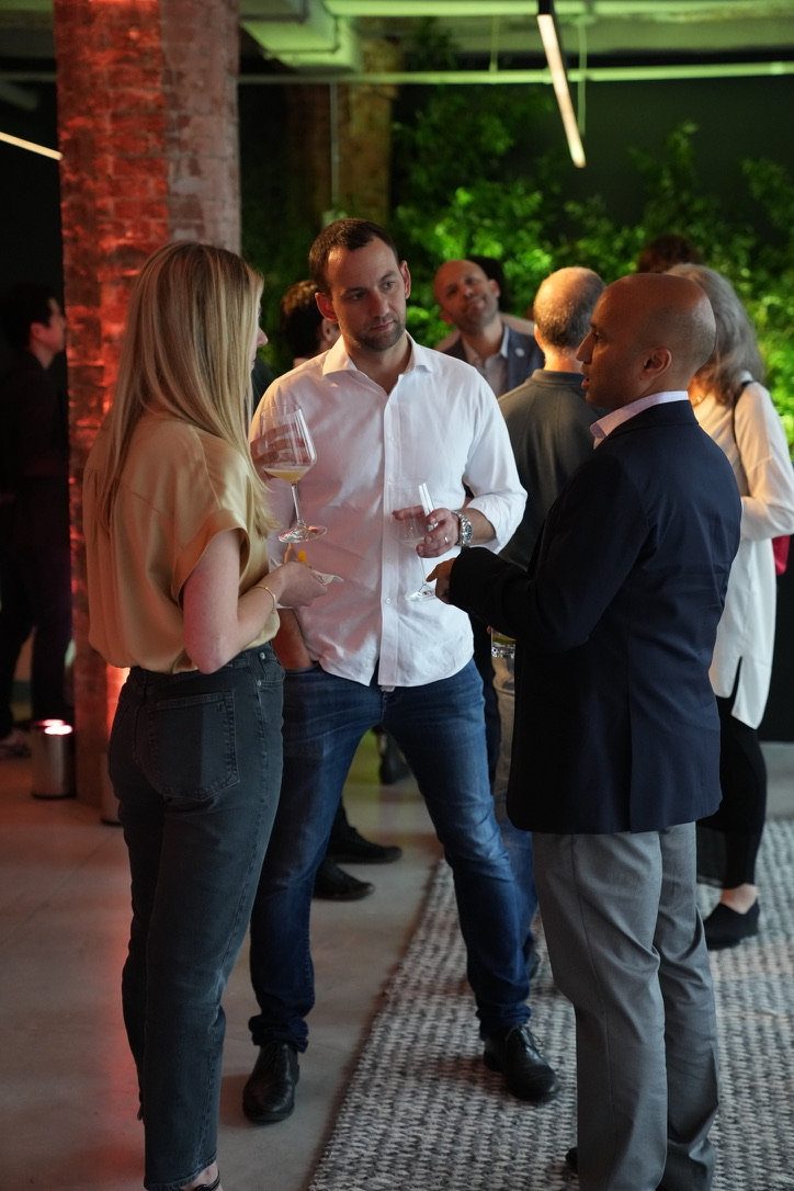
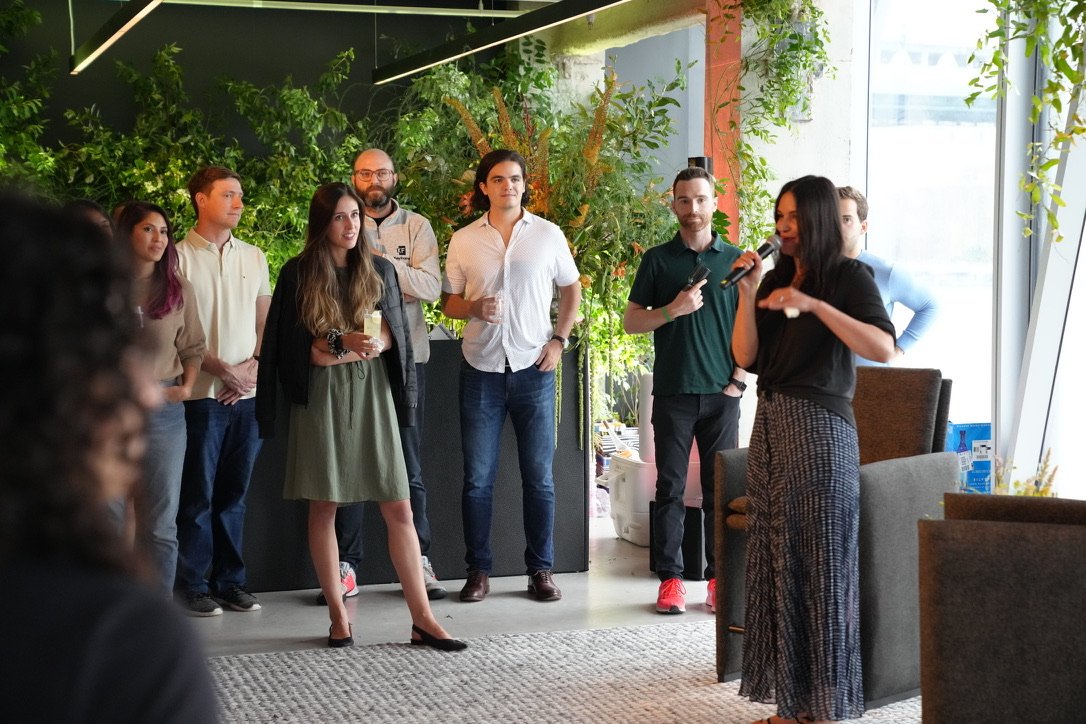
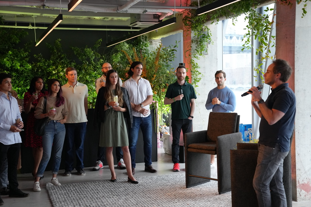
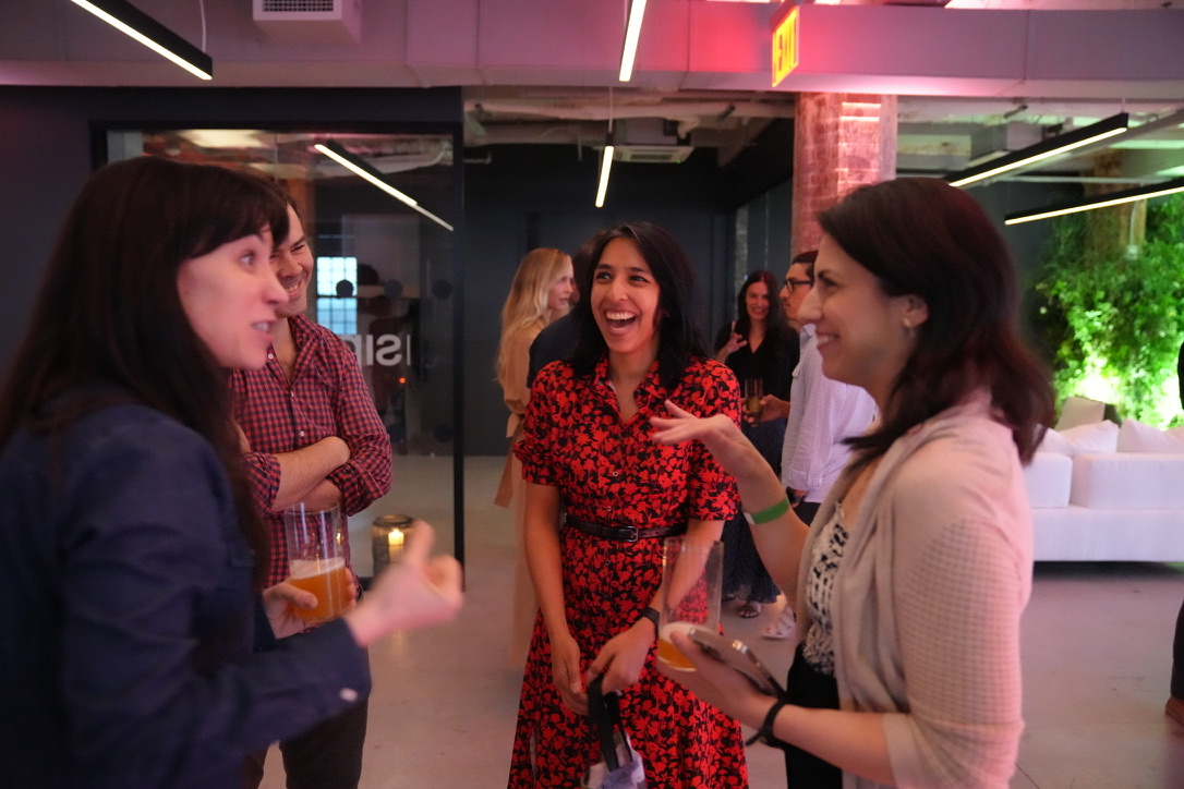
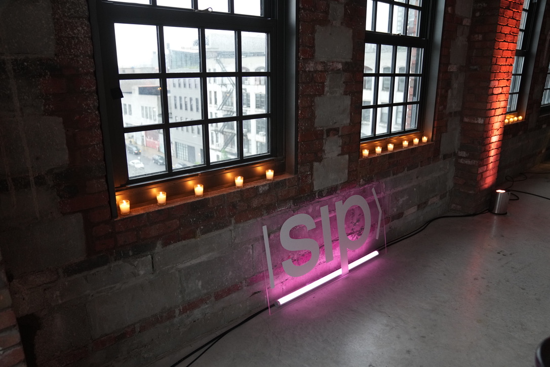
Capital moves in rooms. The Salon series put investors, city officials and operators in one Dumbo loft with a neon mark on the DJ booth, a drinks list built for the night, and no slides. Closed logistics sessions ran the same way at Google.
Arrival, 41 Flatbush, BrooklynDrinks list, designed for the nightOperators and investorsNo slides, one microphoneThe room, mid-remarksBetween sessionsThe mark, fabricated in neon
Summits and conferences
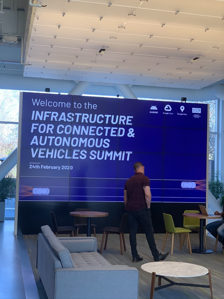
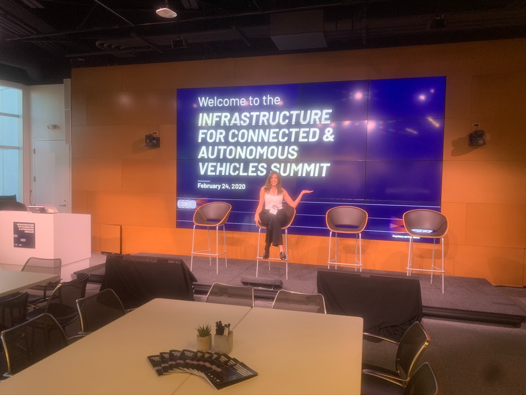
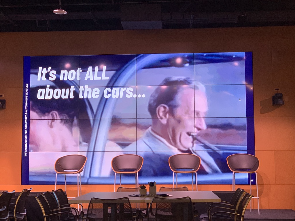
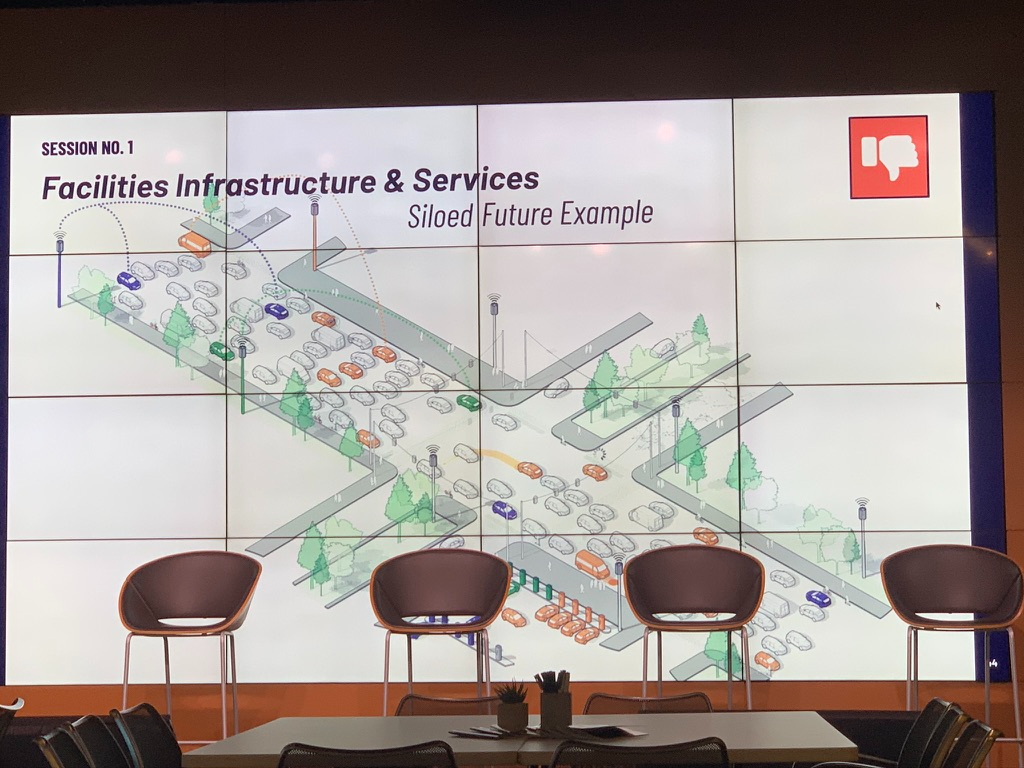
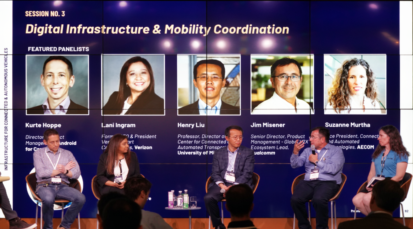
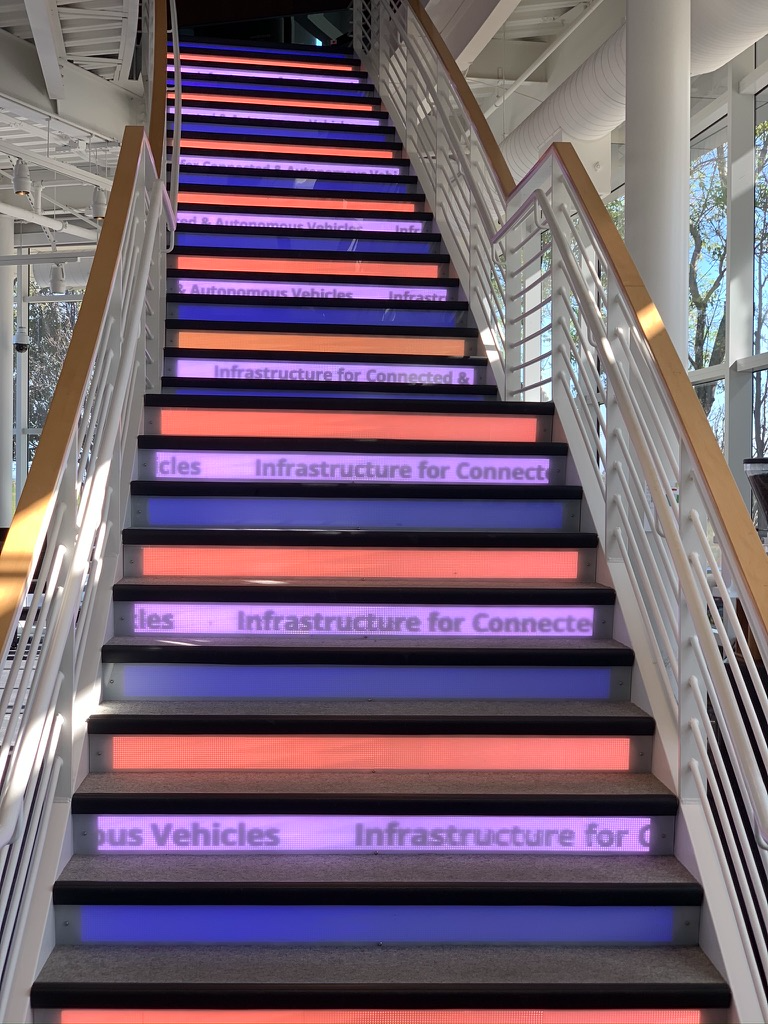
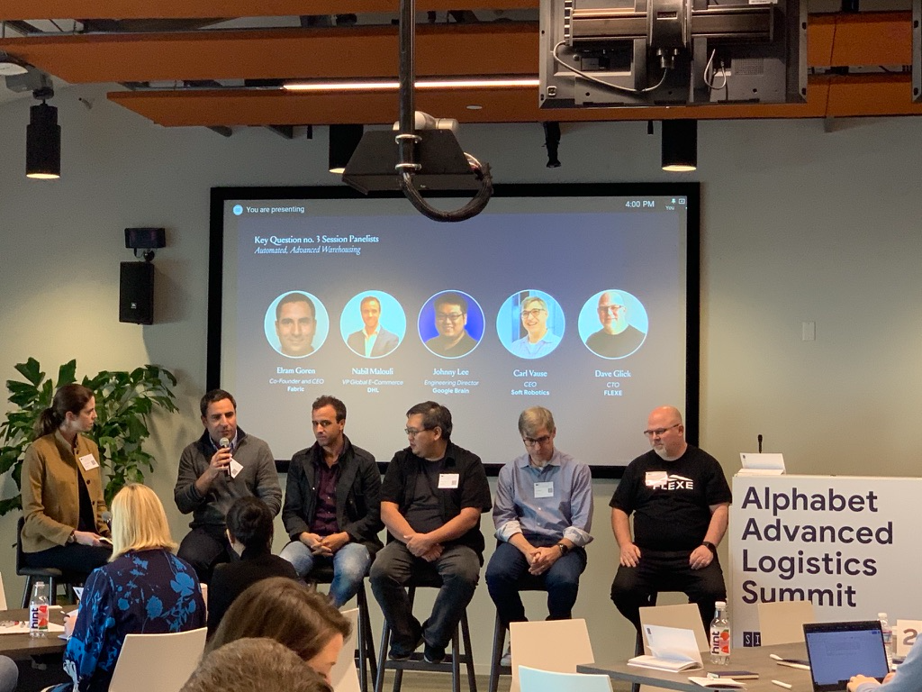
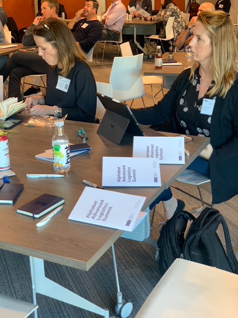
Two invitation-only programmes, one on infrastructure for connected and autonomous vehicles at Google X and one on advanced logistics at Google. I built the identity, the environment, the printed programme and every slide in the room, for panels of city officials, OEMs, DHL, Flexe, Soft Robotics and Google Brain.
Infrastructure for Connected & Autonomous Vehicles Summit, February 2020Title wall, lobbyMain stage, before doorsSession slideSystems diagram, the siloed futurePanel, digital infrastructure & mobility coordinationStair risers, animated
Alphabet Advanced Logistics SummitPanel, automated, advanced warehousingPrinted programme, one per seat
Director of press
I was promoted into the role when the firm’s PR lead left for the White House, and learned it in motion. The argument was that technology-enabled infrastructure is a new asset class, and every platform was evidence for it, from a dedicated corridor running edge compute to shared wireless coverage, a virtual power plant and cold storage for the data floor. The task was to name the category and then get it repeated.
Message development and the agencyI developed the messaging for every launch, raise and platform announcement, shipped the releases with copywriters, and ran 150 Bond as the retained consultancy, which covered story order, embargoes, target lists and pitch follow-through.
Executive visibilityI media-trained and prepped the co-CEOs, the executive committee and the platform leads for interviews, panels and analyst conversations, placed their bylines, and secured quotes and technical sign-off from the teams on deadline.
Coverage, analysts and roomsI landed national coverage, built the analyst and speaking pipeline, and hosted SIP dinners, talks and panels at SXSW and other conferences. A weekly newsletter ran for two years to institutional investors, urbanists, technologists and legacy infrastructure, and it kept the argument in front of the market between announcements.
Colour, type and production standards set in-house, then held across four volumes and every piece of collateral around them.
Colour system, four volumes and their variations
Each volume owns one core colour, and each core carries three variations used for illustration, diagrams and plan keys. Nothing crosses between families, so a reader always knows which volume a spread belongs to.
{{ f.code }}{{ f.name }}{{ f.core }}
{{ sh.role }}{{ sh.hex }}
Core colour on top, its three shades below, running light to dark.
Typography
The plan had to sound technical and human in the same breath. The type does that by refusing to pick a side. Two grotesks and one serif, none of them the obvious choice.
I started with raw Google Docs spanning sustainability, housing, mobility, economics, policy and infrastructure. Nothing in them had been written to be looked at.
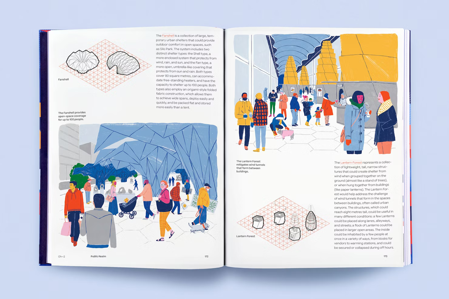
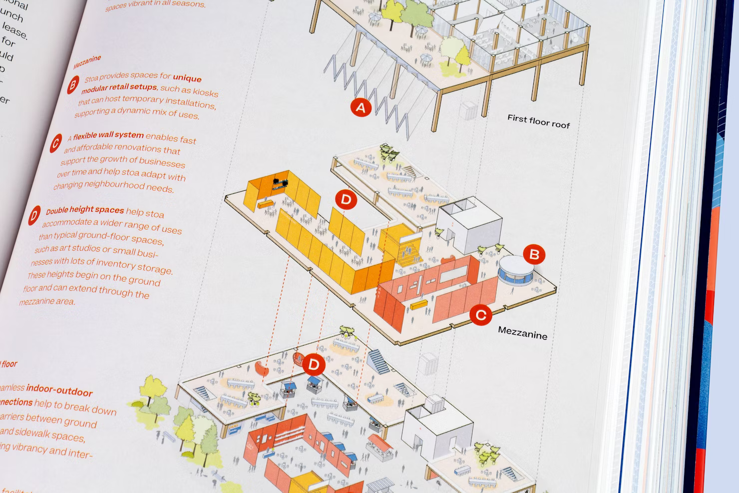
I wireframed every chapter to let the layout follow the logic of the argument, and I built a visual taxonomy ranking maps, charts, renderings, diagrams and illustrations by magnitude. Scale then determined placement, spread behaviour and proximity to text, which is what gave 1,524 pages a consistent rhythm.
Execution path
The operating sequence for turning an unstructured, multi-disciplinary corpus into a coherent publication.
I read and coded the full body of Google Docs across policy, engineering, urban design, sustainability and finance, tagging each passage with a required visual type and a narrative weight. The tracker that came out of it dictated what got built and where it lived.
I've spent a decade making things feel inevitable before they exist.
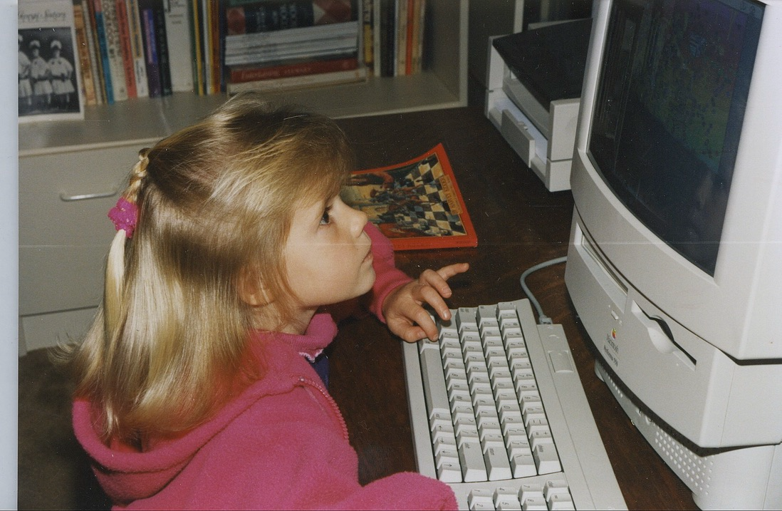
Leigh WhitingFirst workstation, c. 1994
I am an independent design and strategy director working across brand, publication and digital, on subjects most people find impenetrable: urban policy, engineering, infrastructure finance, deep technology. I get to conceptual clarity first and then to craft.
Everything I do starts with learning the subject properly, down to the actual mechanics, deep enough to sit with the engineers and enjoy the detail. I read it, ask about it, prototype a version, test it, and let what I learn change the work. AI handles the production in that loop now, from first concepts to motion to a coded prototype, and I set the intent and approve what ships.
I work closest with CEOs and co-founders who can see the whole thing clearly but have no way to draw it. I take the half-formed idea out of their head, give it form, and hand it back sharper than they described it.
I measure the work by whether the thinking behind it is clear enough for the next person to build on, and whether the people who made it came out better than they went in.
Thirteen years in and still learning a new subject every project. I am a player-coach by preference. I set the bar and still make the highest-priority work myself, then turn what worked into brand kits, templates, prompts and playbooks a lean team can run without me. I work fractionally with companies that need a senior creative mind in the room without the full-time overhead.
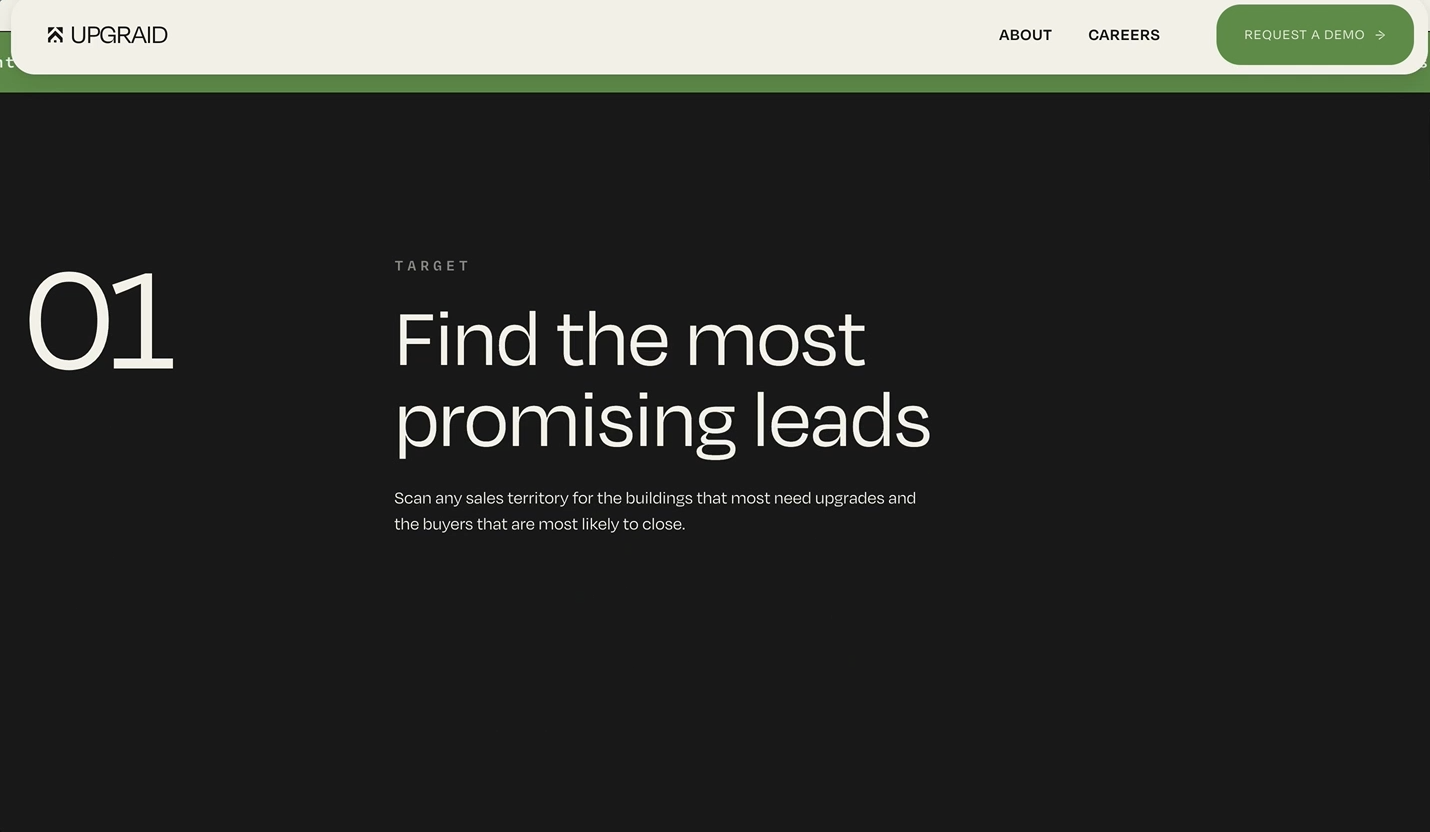
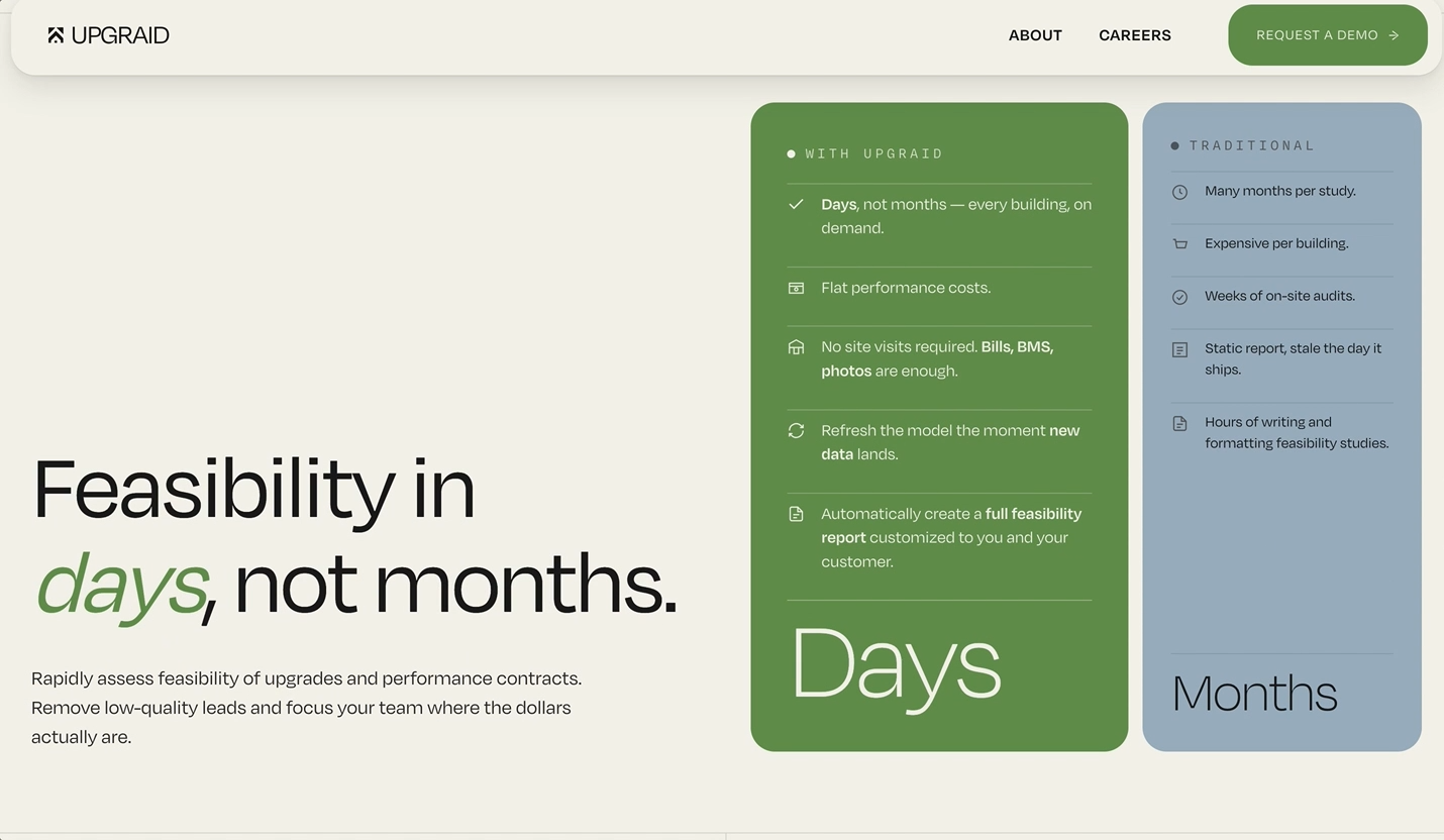
Fractional Design Director, STUDIO•USEmbedded design and brand leadership for ventures in infrastructure, sustainability and deep technology. Interim Creative Director for Upgraid, FoundationAI and Catalyst Housing Group. A five-week AI-native sprint for Upgraid delivered brand, website and positioning supporting $44M in competitive wins and 80% faster sales cycles.
2019–2022
Design Director & PR Director, Sidewalk Infrastructure PartnersFirst and only creative hire for an Alphabet-backed venture. Built the narrative and LP materials behind a $1.4B raise from Alphabet, StepStone and Ontario Teachers' Pension Plan; branded five portfolio companies; led press for 18 months; directed the $2.5M Brooklyn headquarters.
2020–2022
Founding Design Director, CavnueSole designer on the three-person team that won the Michigan DOT RFP for the first automated vehicle corridor, then built the brand. Named a TIME Best Invention.
2018–2019
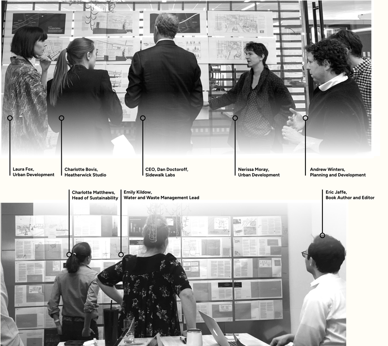
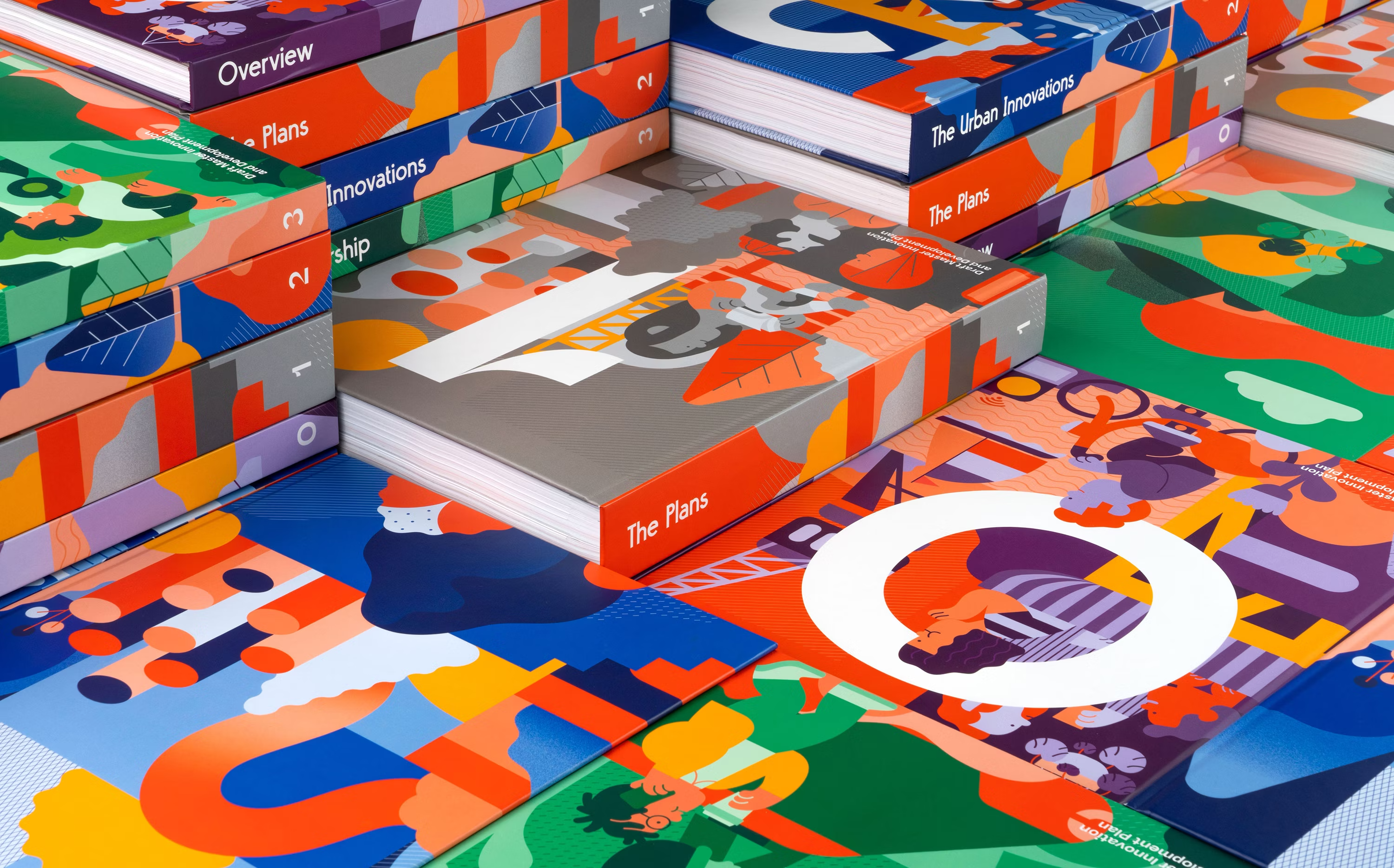
Design Lead, Sidewalk Labs • GoogleInternal design direction and leadership on Toronto Tomorrow, the four-volume Master Innovation and Development Plan for the city of Toronto.
Modes of practice
How I have worked
Fractional, in-house, and inside agency teams. The standard of the work is the same in each.
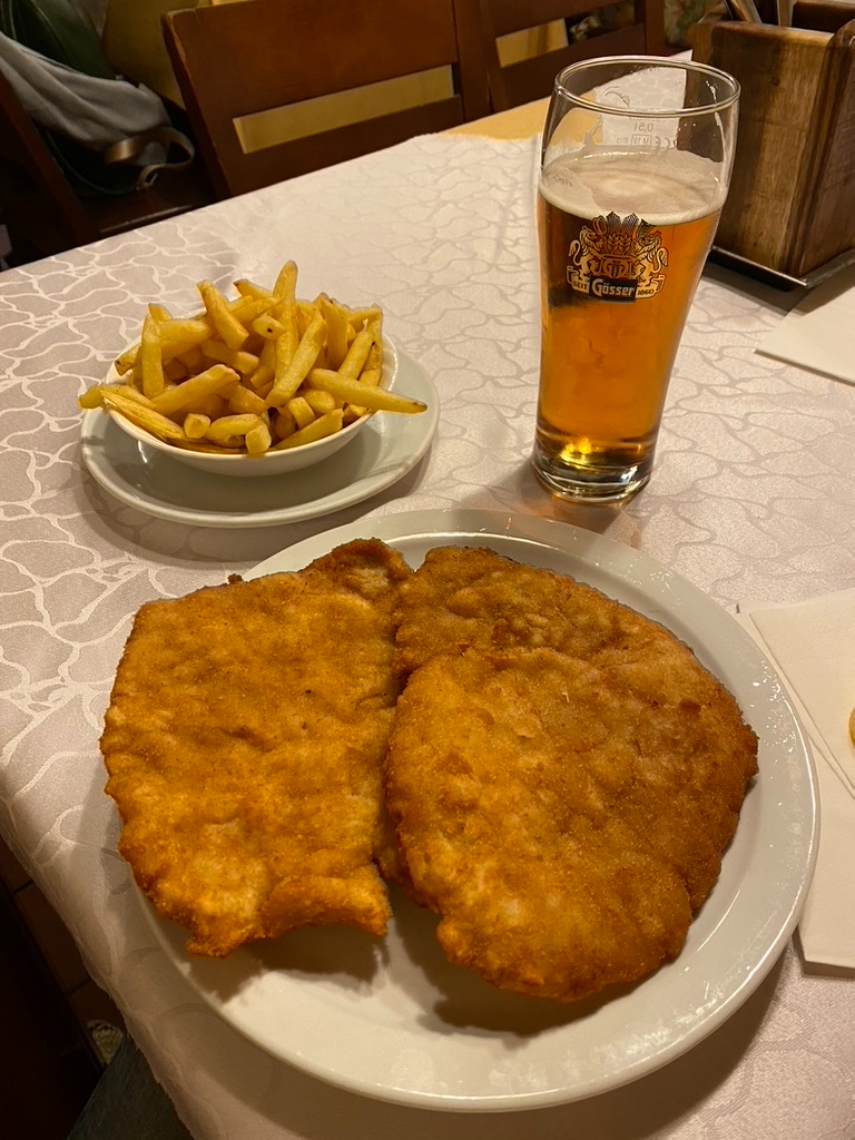
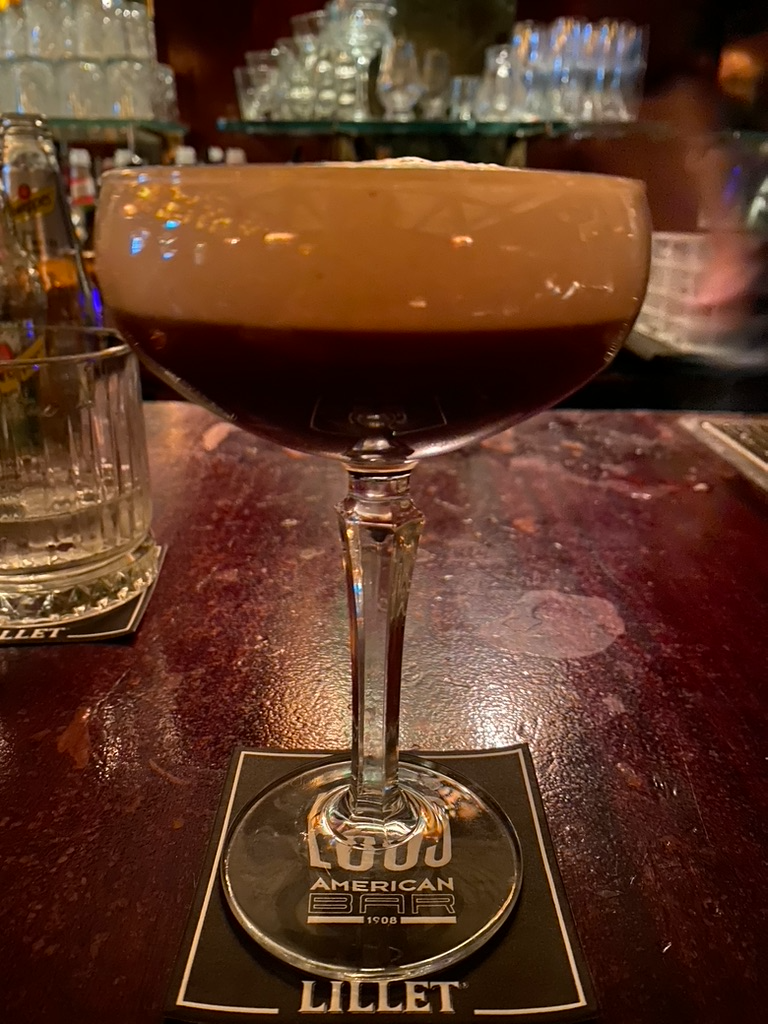
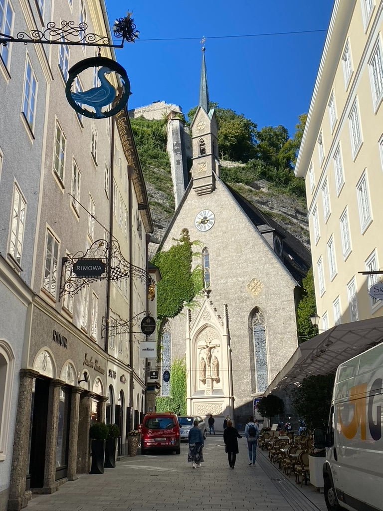
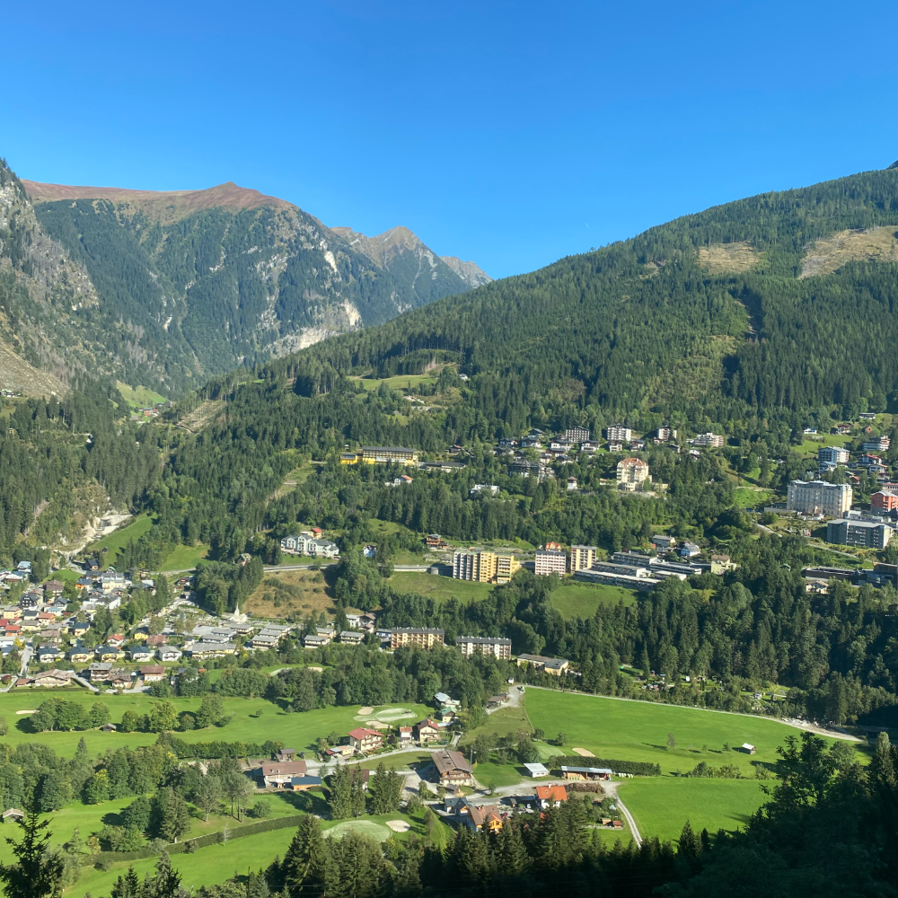
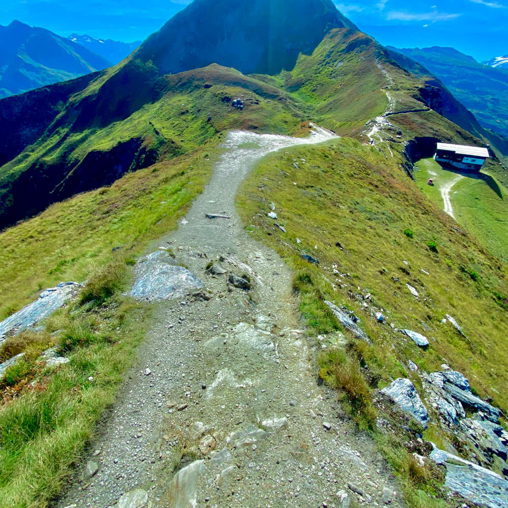
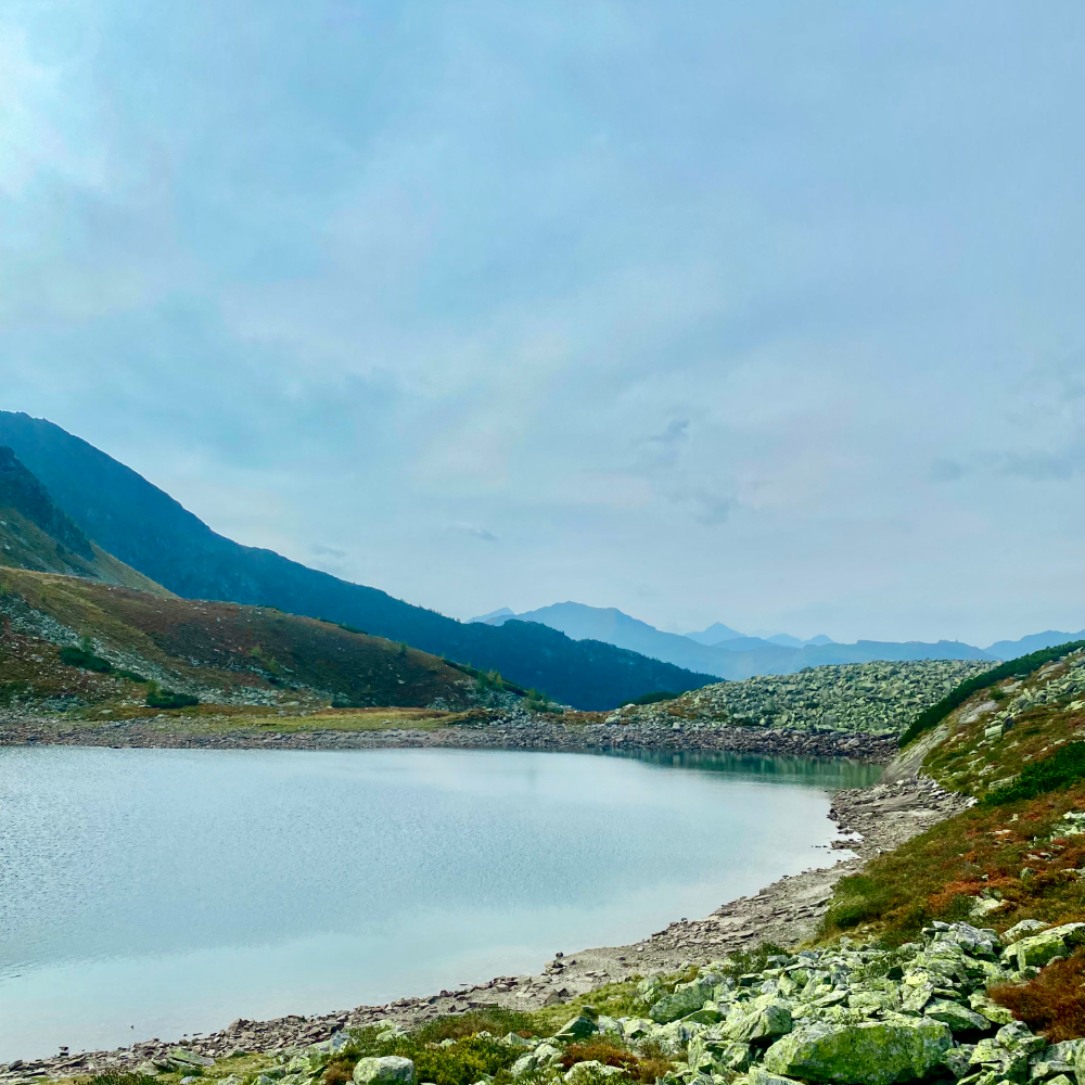
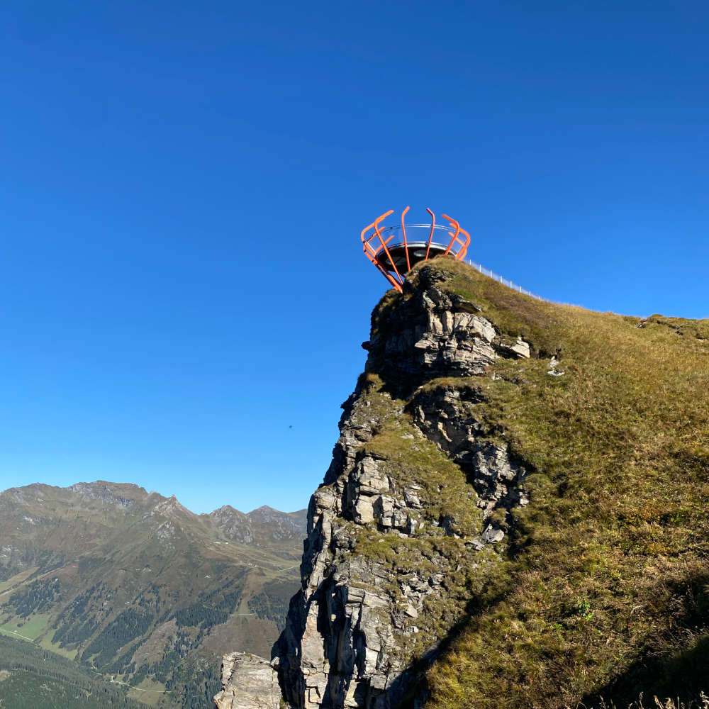
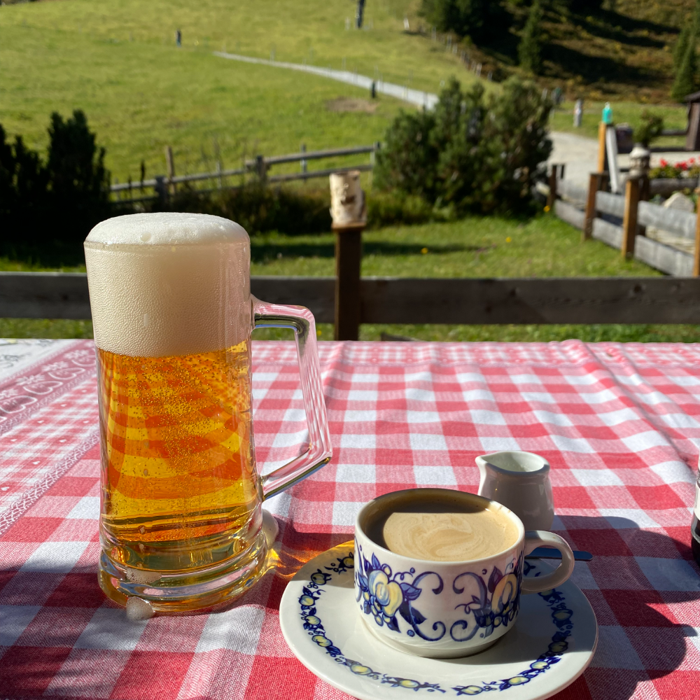
Following my grandmother’s diaries across post-war Europe
She helped rebuild Vienna after the war. After nine years living and working in New York, I needed a change. Fullfilling a lifelong goal of following my "Grandy's" diaries through Austria I embarked a trip that would change the course of my life. It was a grand adventure that I am still on!
{{ arcMeta }}{{ arcLabel }}{{ arcNote }}
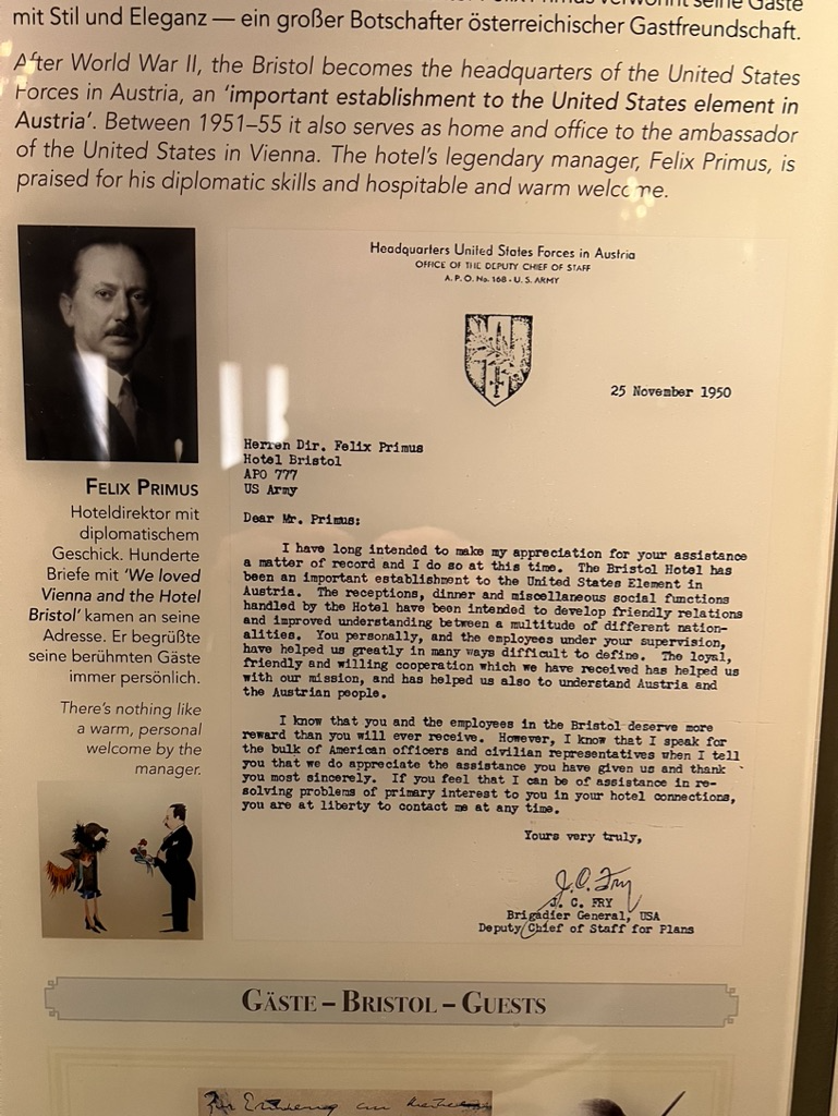
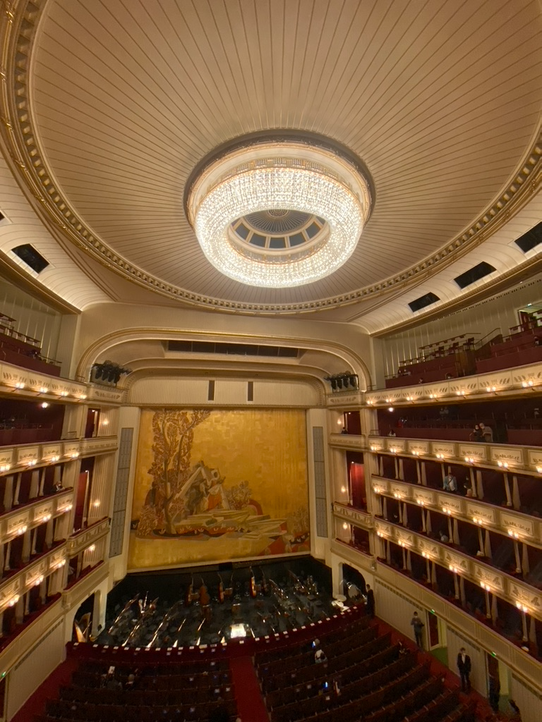
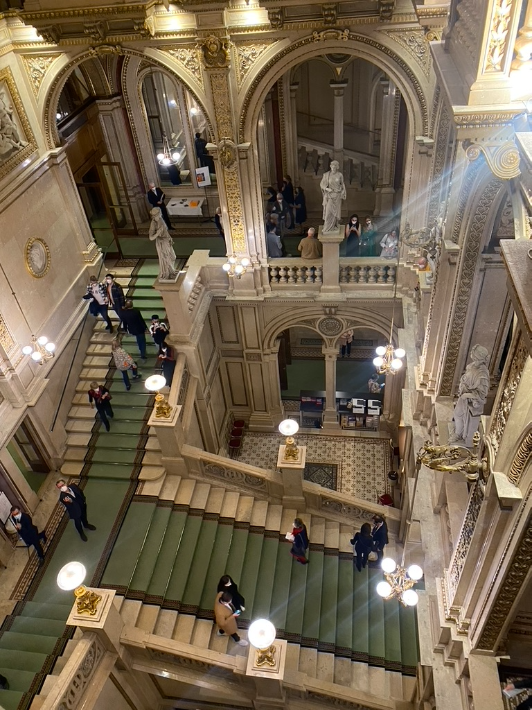
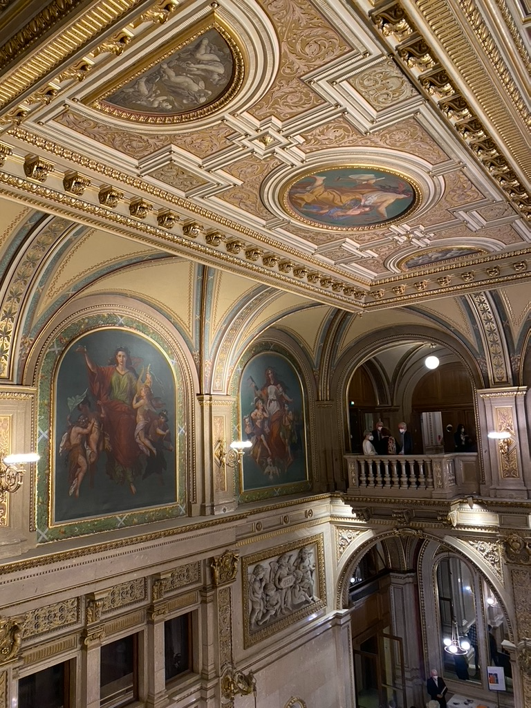
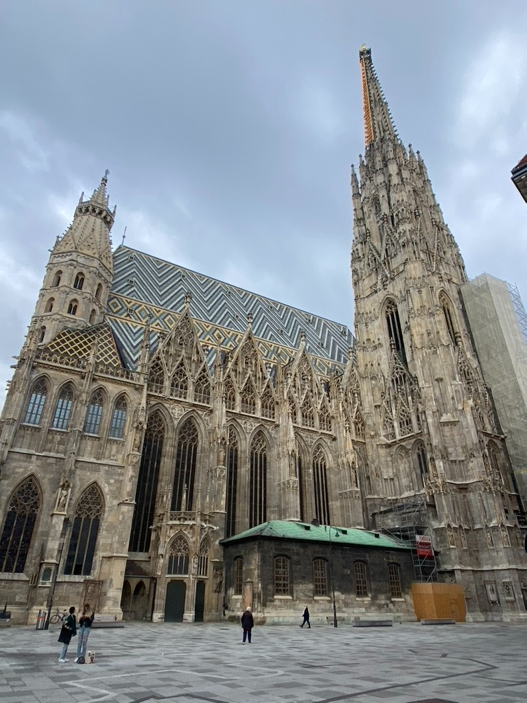
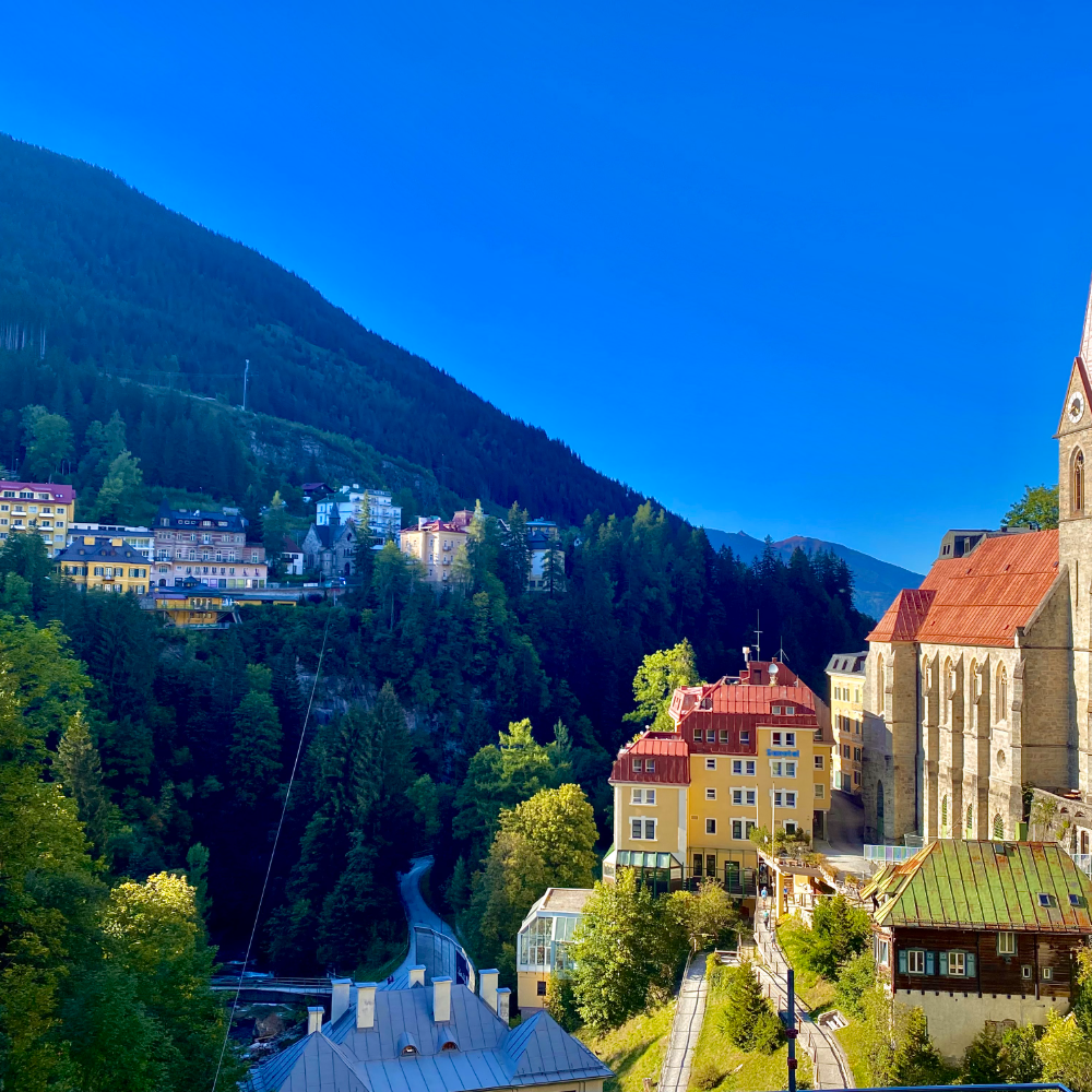
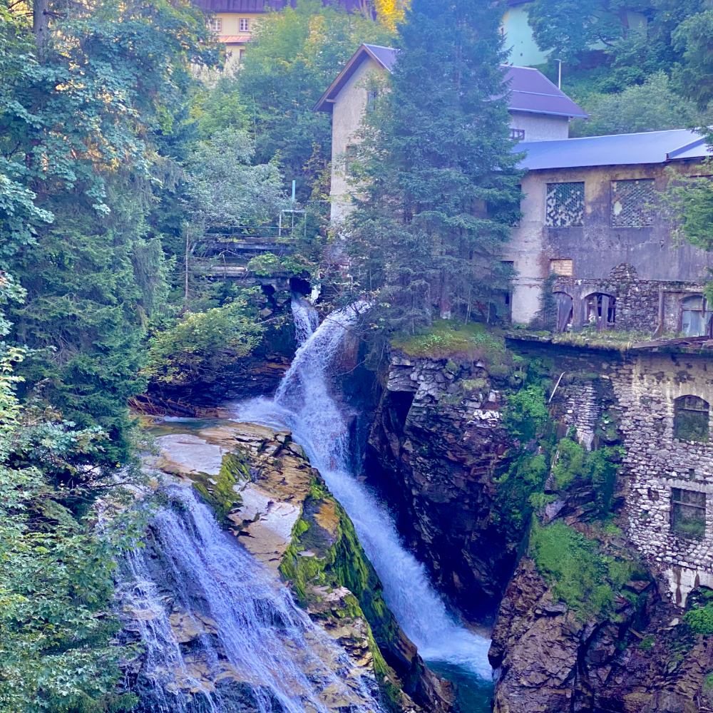
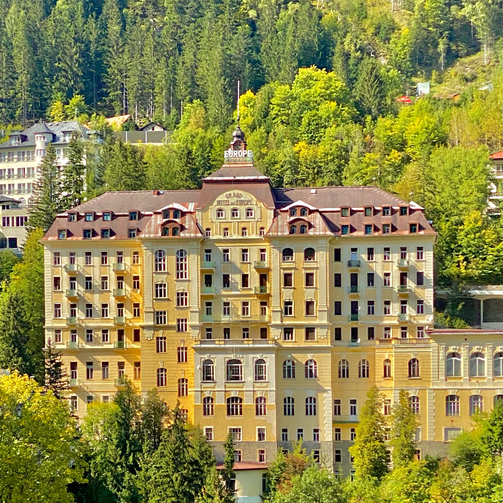
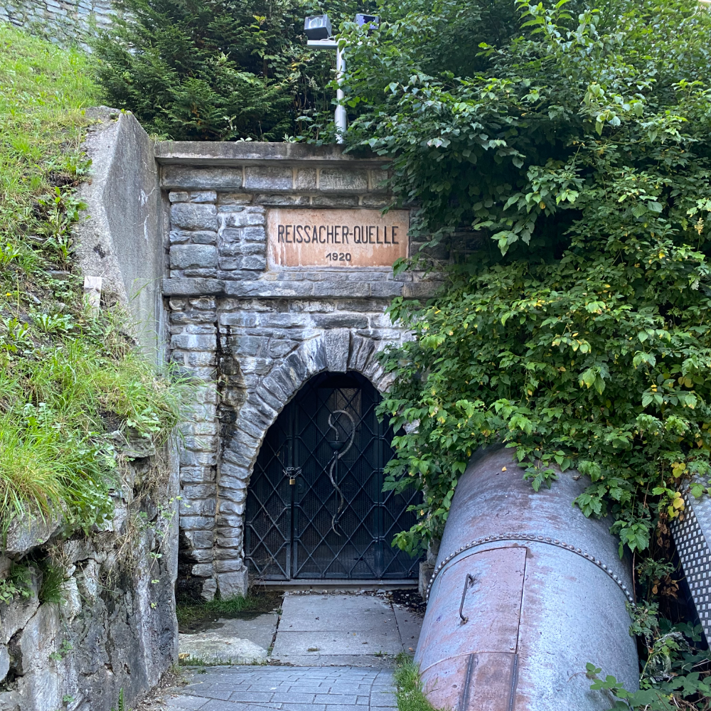
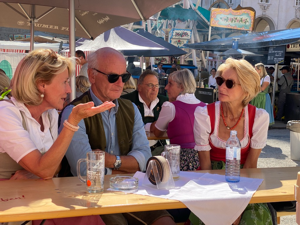
The Bristol, still keeping the 1950 letter to Felix Primus on the wallViennaThe Staatsoper from the upper circleViennaThe Vienna Opera House, where she often went with friends or on datesViennaGilt and painted panels above the landingViennaStephansdom, the roof rebuilt after the war she was writing throughViennaSchnitzel and a GösserViennaLoos’ American Bar, 1908 and unchangedViennaGetreidegasse, on the way southSalzburgThe valley from above, the spa town stacked up the slopeBad GasteinNikolauskirche and the funicular line down the gorgeBad GasteinThe Gasteiner Ache falling through the middle of townBad GasteinGrand Hotel de l’Europe, empty since the cure yearsBad GasteinReissacher-Quelle, 1920, one of the thermal springsBad GasteinThe ridge trail up the StubnerkogelBad GasteinA tarn below the ridge, the water still cold in SeptemberBad GasteinThe viewing platform cantilevered off the rockBad GasteinA Märzen and a Verlängerter on the way downBad GasteinRupertikirtag, dirndls and Trumer PilsSalzburg
The logistics of travelling with a dog across bordersSpurred by my travel following my "Grandy's" diaries, I decided to travel for a year and a half with my sweet rescue, Penny. Along the way Penny obtained her French passport and learned a few new commands in different languages, "Bisou" in French being my favorite.
Where she has beenSeventeen stops · hover a marker
Playground
Unbriefed, unfinished, unclient-ed. Things I make to stay sharp, type drawing, print tests, tooling, the occasional map. Some of it becomes method later.



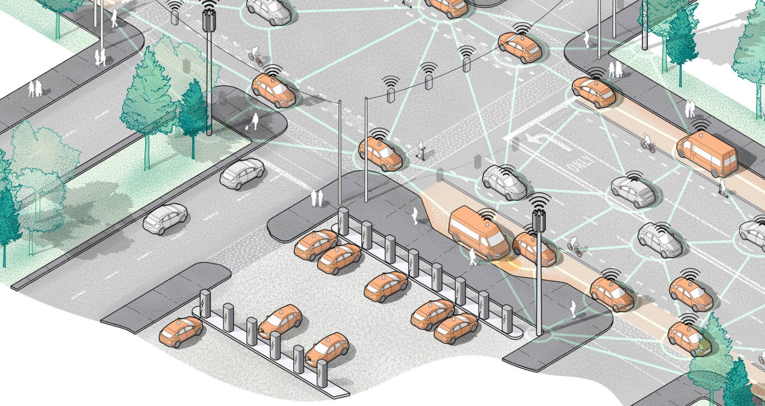
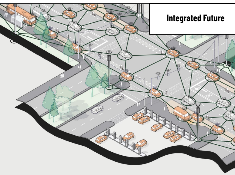
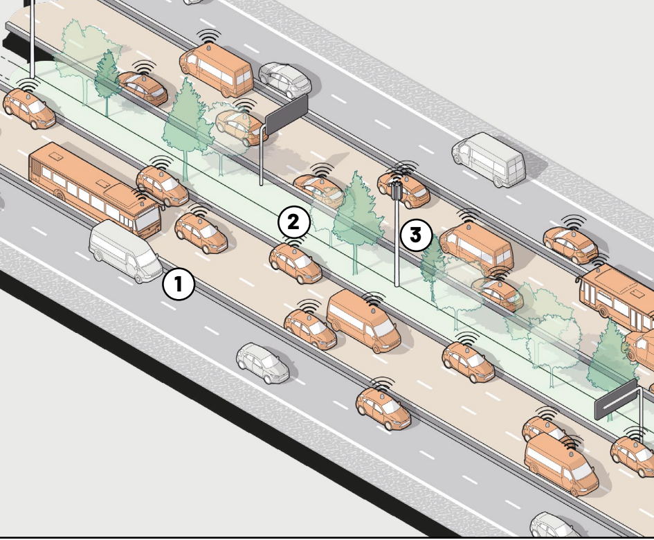
 Best Inventions, Cavnue, America’s first dedicated corridor for autonomous vehicles.
Cavnue2020
Bloomberg
Sidewalk Infrastructure Partners and the market for resilient infrastructure.
SIP2020–2022
Best Inventions, Cavnue, America’s first dedicated corridor for autonomous vehicles.
Cavnue2020
Bloomberg
Sidewalk Infrastructure Partners and the market for resilient infrastructure.
SIP2020–2022
 Alphabet-backed SIP on financing the infrastructure the grid does not have yet.
SIP2020–2022
Alphabet-backed SIP on financing the infrastructure the grid does not have yet.
SIP2020–2022
 The $1.4B raise across Alphabet, StepStone and Ontario Teachers’ Pension Plan.
SIP2021
Fast Company
Design and communications for infrastructure that has to be believed before it is built.
SIP2020–2022
The $1.4B raise across Alphabet, StepStone and Ontario Teachers’ Pension Plan.
SIP2021
Fast Company
Design and communications for infrastructure that has to be believed before it is built.
SIP2020–2022
 The $2.5M Brooklyn headquarters, a hospitality-forward space for an infrastructure firm.
The office2021
The $2.5M Brooklyn headquarters, a hospitality-forward space for an infrastructure firm.
The office2021